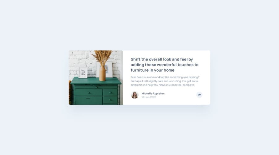
Design comparison
Solution retrospective
I included smooth transitions and added keyboard support for the panel and menu. It makes the user experience much more accessible and intuitive.
I also implemented functionality to close the panel/menu by clicking outside of them, which adds a nice touch.
Next time, I'd look into simplifying my code — in particular, seeing if I could reuse the share button across mobile and desktop.
What challenges did you encounter, and how did you overcome them?My share button triggered both the desktop panel and the mobile menu in unexpected ways at first. I got around this by using separate buttons for mobile and desktop.
What specific areas of your project would you like help with?Given a single button, how can I trigger separate JavaScript functions (or the same function, but with different arguments) based on device type / screen size?
For example, I would like the button to have onclick="togglePanel(event)" for mobile but onclick="toggleMenu(event)" for desktop.
Or is it better to just use two separate buttons (like I did) — one for mobile and one for desktop — each calling their own function?
Community feedback
- @KapteynUniversePosted 22 days ago
Hey Josh, nice job.
For the based on screen size question: you can use
window.innerWidth;function () { const w = window.innerWidth; if (w <= 880) { this } else { that } };Rather than main, applying flex to the body for the future might be better for centering. Because there are going to be header, footer and etc. too. Since you used flexbox, you can also use items-center instead of the mx-auto.
Nice transations, a little hover effect on the anchor tags might be nice too.
1 - @huyphan2210Posted 22 days ago
Hi, @jboys
I checked out your solution and I have some thoughts:
- "How can I trigger different JavaScript functions (or the same function with different arguments) based on device type or screen size?" This can be handled by checking the screen size whenever users click the button. For example:
function toggle() { const screenWidth = window.innerWidth; // Get viewport width if (screenWidth <= 1024) { // Code for handling panel } else { // Code for handling menu } }- You can also check the device type by using
navigator.userAgent, but keep in mind that it’s not entirely reliable because user-agent strings can be inconsistent across devices and browsers. - Things could be simpler if
#menuand#panelwere the same element instead of separate ones—this could be managed using CSS alone. If you're open to it, I'd recommend diving into pure CSS to build layouts. It can provide a deeper understanding, which will also help when you use any CSS library (like Tailwind).
Hope this helps!
1
Please log in to post a comment
Log in with GitHubJoin our Discord community
Join thousands of Frontend Mentor community members taking the challenges, sharing resources, helping each other, and chatting about all things front-end!
Join our Discord
