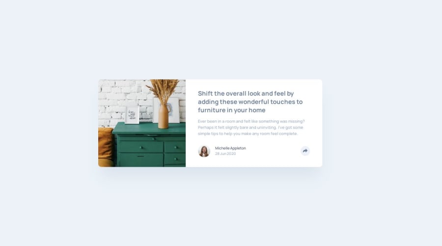
Design comparison
Solution retrospective
I started out trying to make the structure of this component totally clean and robust, and I did OK at first.
I was using slots with fallback content to try to capture all the styles and behaviours before introducing any real content, but I lost my way a bit with that when it came to the share button.
I put waaaay too much time into allowing the share button to slide responsively along its tail to make it fully responsive over the 100px or so when the screen is too small to accommodate it off the right edge.
Anyhoo. I got there in the end.
Community feedback
- @guztrilloPosted over 3 years ago
Hey Mark. I had the same issue: put too much effort trying to make the share button responsive for small displays. And I failed too hahaha. I ended adding a
min-widthvalue just for no broke the design. Anyways, your solution is great!0 - @markup-mitchellPosted over 4 years ago
Thanks Matt.
I've been tinkering with svelte for a while, and I really like it. svelte + tailwind is such a lean way to build something fast.
0 - @mattstuddertPosted over 4 years ago
Nice solution, Mark! Paying close attention to detail is a good trait to have. So it's definitely not a bad thing!
I see you're starting to play around with Svelte. How are you liking it so far?
0
Please log in to post a comment
Log in with GitHubJoin our Discord community
Join thousands of Frontend Mentor community members taking the challenges, sharing resources, helping each other, and chatting about all things front-end!
Join our Discord
