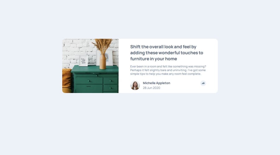
article component with html css flex and js
Design comparison
Solution retrospective
I am not proud of the solution here. I need feedback on designing popup menu on mobile sized screens. I know i used too much id's instead of class'. I will update the project according to semantic elements.
What challenges did you encounter, and how did you overcome them?Designing the popup menu was challenging on mobile screens. I could not find a way to approach this.
What specific areas of your project would you like help with?I need feedback on designing popup menu on mobile sized screens. On desktop size, there is a triangle on popup menu. I could not find a way to make this besides using and empty div and turning it 45 degrees. If there is a proper way to do this i am open to any suggestions.
Community feedback
- P@Lo-DeckPosted 6 months ago
Hi well done for this challenge,
I'll give this link you check out the mistake for HTML and CSS. 3WC validator.
It's better to use
emorreminstead ofpx. FreeCodeCamp.It's easier to start with a mobile-approach FreeCodeCamp.
And for the triangle you can use
afterandclip-path.social-media::after{ content: ''; width: 1.5625rem; height: 0.875rem; position: absolute; top: 3.4rem; left: 6.5rem; clip-path: polygon(100% 0, 0 0, 53% 100%); background-color: var(--veryDarkGrayishBlue); }Here a link : clip-path generator.
Hope to be helpful.
Marked as helpful0
Please log in to post a comment
Log in with GitHubJoin our Discord community
Join thousands of Frontend Mentor community members taking the challenges, sharing resources, helping each other, and chatting about all things front-end!
Join our Discord
