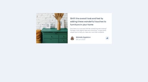
Submitted over 1 year agoA solution to the Article preview component challenge
Article Component (Sass + JS)
@mroungou

Solution retrospective
What are you most proud of, and what would you do differently next time?
I am proud that I have started to develop a developer mindset. Setting time goals for completion and trying to get the job done as quickly as possible without sacrificing quality.
Next time I think I will focus on avoiding "hacks" to get a specific function to work.
What challenges did you encounter, and how did you overcome them?A challenge I faced was getting the text to overlap with the image. I used CSS grids to overcome this challenge.
What specific areas of your project would you like help with?I would like help with getting the triangle for the socials div pop-up
Code
Loading...
Please log in to post a comment
Log in with GitHubCommunity feedback
No feedback yet. Be the first to give feedback on Malick Roungou's solution.
Join our Discord community
Join thousands of Frontend Mentor community members taking the challenges, sharing resources, helping each other, and chatting about all things front-end!
Join our Discord