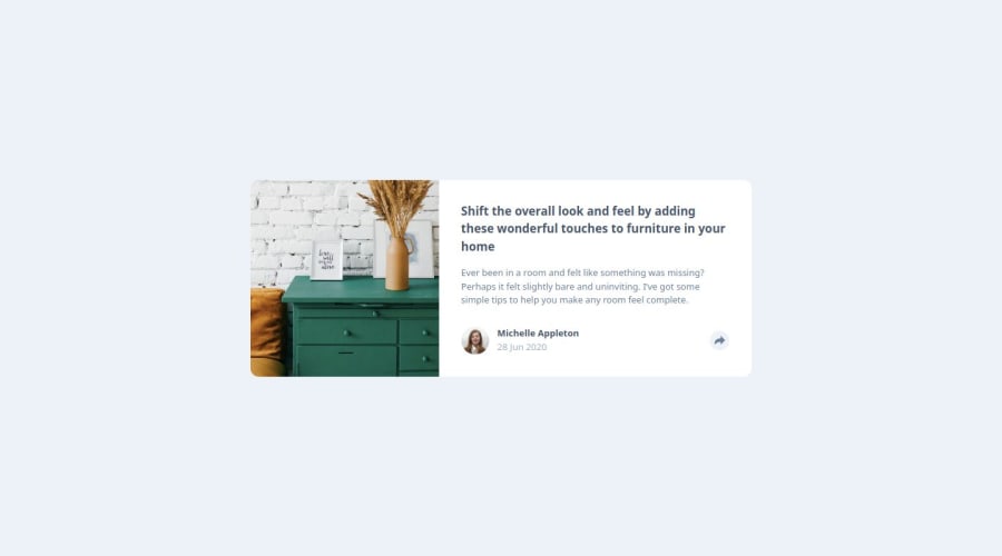
article componenet master whit tailwind & js vanilla
Design comparison
Solution retrospective
I'm really proud of the function that removes a class if the screen width is greater than x. Surely, I would do the arrow that comes out of the social icons container differently.
What challenges did you encounter, and how did you overcome them?The biggest challenge I encountered was definitely the arrow of the social icons in desktop mode. I solved it by creating three background-colored squares, then rotating them until forming an arrow.
What specific areas of your project would you like help with?I didn't understand why giving the class start-0 in Tailwind I couldn't overwrite it with end-0, I solved it by creating a function that removes start-0 but maybe there's a better way. Any suggestions?
Community feedback
Please log in to post a comment
Log in with GitHubJoin our Discord community
Join thousands of Frontend Mentor community members taking the challenges, sharing resources, helping each other, and chatting about all things front-end!
Join our Discord
