π¨βπ¨ Art Gallery Website VANILLA CSS (CSS Animations & Hover Effects)
Design comparison
Solution retrospective
πΎ Hello, Frontend Mentor coding community. This is my solution for the Art Gallery Website
When I started my journey in Frontend Mentor this was my dream challenge that I always wanted to complete. Now, after 7 months (I know it took to long, but I am a noob πββοΈ) its done! Challenge accepted and completed.
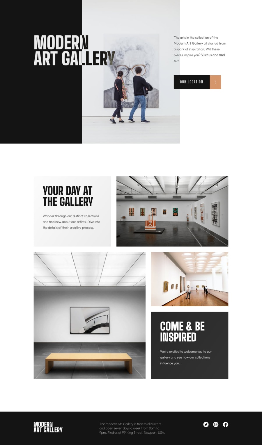
The challenge was really challenging, the main struggle I had building this html structure/css was with the header and the image gallery. I had some fun trying to figure out how to make the grid-template-area
and after some tutorials I get how to use this tool (was my first time with grid-area).
π¨ I added some custom features:
- π½ Hover Effects
- π§ββοΈ CSS Animations
π§ Special thanks to:
- @AdrianoEscarabote - AdrianoEscarabote Profile that helped me with the Leaflet Map (I have zero knowledge with JS so I had no idea how to include the map).
- @VanzaSetia VanzaSetia Profile to explaining me how to make the h1 heading effect in the header with
mix-blend-mode: difference
. - @elaineleung ElaineLeung Profile To have explained me how to add CSS Animations. Now I am really happy adding motion everywhere hahaha. She is of the FEM greatest mentors.
Tutorials used to learn grid-template-area
:
- DESIGN COURSE - Easily Structure your Layout with CSS Grid's 'grid-template-areas'
- KEVIN POWELL - Why CSS grid-area is the best property for laying out content'
πFollow me in my journey to finish all HTML/CSS
only challenges (Only 1 missing)! Gotta Catch βEm All
Ill be happy to hear any feedback and advice!
Community feedback
- @AdrianoEscarabotePosted about 2 years ago
Hi Lucas, your solution is very complete, everything is incredible!
You always do an amazing job on your projects! I can say that in my opinion, this is the most beautiful solution I have ever seen for this challenge. Congratulations on your performance, here on the fem platform for reaching incredible numbers, with your super valuable feedback! and also for your effort of wanting to learn new things, and build amazing projects!
Marked as helpful3@correlucasPosted about 2 years ago@AdrianoEscarabote Thank you my friend. Soon I'll need your help working with Js βοΈπ
1 - @wendyhamelPosted about 2 years ago
This looks great! But previous comments already established that....
I noticed one thing: the
.h1-heading
text where you usedmix-blend-mode: difference;
Blends with the image as well. It would look sharp on all screen sizes if it didn't do that.Did you notice it and settled for this? Did you try anything to change it? I love to figure out these kind of challenges within the challenge. I don't know how to fix it (yet). I have a few idea's and plan on finding out what would work.
Happy Coding!
Marked as helpful1@correlucasPosted about 2 years ago@wendyhamel Hey Wendy, thank you for the feedback. I dont understand which problem happen with the H1 heading. You mean that is not 100% visible in the mobile version? If you explain me better maybe I can change it.
Thanks
0@wendyhamelPosted about 2 years ago@correlucas You can already see it in the screenshot made by FEM. The letter 'Y' from Gallery looks like there is smoke around it. (It's the hair of the lady in the art piece). Because of
mix-blend-mode: difference
the black of the text fades where the hair of the lady comes behind it.Marked as helpful1@correlucasPosted about 2 years ago@wendyhamel Ah okay. I didn't tried to fix this effect because I liked a lots the blend between the text and the background.
1@wendyhamelPosted about 2 years ago@correlucas It does look nice here yes. I agree. But it got me thinking and I wanted to try to get the text to be on top of the image and not blending with it. I've been working on it in a codepen. The solution that worked was not my favorite, it needed an extra layer of text. Maybe I'll look for more ways to do it later on.
Marked as helpful0@correlucasPosted about 2 years ago@wendyhamel this is nice, if you want you can share your solution with the text effect working on without blend the photo. π
0@wendyhamelPosted about 2 years ago@correlucas It's just a quick example. I used a svg as background so I could change the color. my mix-blend-mode example
1 - @huey-ioPosted about 2 years ago
Such an impressive feat, happy to have you as a friend lucas your solution's always look top tier. You continue to motivate me with your work. Great job man, one more challenge left is amazing. Can't wait to see it
Marked as helpful1@correlucasPosted about 2 years ago@huey-io Thank you bro. One more left βοΈ
1 - @DavidDelannoyDeveloppementPosted about 2 years ago
What a wonderful job @Lucas!!! π I will be very proud when I achieve this result. You are a true source of inspiration and motivation! Congratulations and thank you! π
2@correlucasPosted about 2 years ago@DavidDelannoyDeveloppement Thank you for the kind words David ππ
1 - @khaya05Posted about 2 years ago
Great job man. Your solution is impressive and very inspiring!!!
1 - @jorgealves-bPosted about 2 years ago
I will try to do this beautiful work
1 - @niemalPosted over 1 year ago
The top section animation with the smooth roll-up is just beautiful. Good job!
0
Please log in to post a comment
Log in with GitHubJoin our Discord community
Join thousands of Frontend Mentor community members taking the challenges, sharing resources, helping each other, and chatting about all things front-end!
Join our Discord