Design comparison
Solution retrospective
Hello Everyone! š
It has been a while since I submitted the last solution. That's because I had an exam and my internet connection was down. š
Anyway, it feels good to be able to submit another solution. This is my first challenge for doing a two-page website. It's also the first time I create a map. Luckily, the Leaflet quick start guide is easy to follow.
I have several questions:
- On the location page, there's a map image. The alternative text for it is "Map of Modern Art Gallery". I don't know that it is enough for screen reader users. Maybe, I should explain the location in great detail like "Modern Art Gallery map. It's located at 99 King Street near International Tennis Hall of Fame..." (?). I think that would be overly descriptive. So, is telling the screen reader users that it is a map of "someplace" enough?
- Still on the location page, I am not sure about the HTML markup. There are these texts, "99 King Street", "Newport", "RI 02840", and "United States of America". So, my question is, should I put each text as its own paragraph or I wrap the text with one paragraph element and then use
span
to move each text to seat on its own line? (Or am I just overthinking about this š)
Like this?
<div class="area__wrapper">
<p class="area__street">99 King Street</p>
<div class="area__details">
<p class="area__city">Newport</p>
<p class="area__state">RI 02840</p>
<p class="area__country">United States of America</p>
</div>
</div>
Or like this?
<p class="area__wrapper">
<span class="area__street">99 King Street</span>
<div class="area__details">
<span class="area__city">Newport</span>
<span class="area__state">RI 02840</span>
<span class="area__country">United States of America</span>
</div>
</p>
- To simplify my second question, is it should be read as one sentence? (Or it doesn't matter š)
I have created the site without Leaflet JS. The map is an image that has been provided by Frontend Mentor. Here's the link: https://noleaflet.netlify.app/. This might be useful to understand my first question.
Any questions on the technique that I'm using are welcome! š
Also, if you have finished this challenge and would like me to give feedback on it, please include a link to your solution. I would be glad to help you! š
Thanks!
Community feedback
- @brasspetalsPosted over 2 years ago
Hi, Vanza! Another excellent job! š
To your questions:
- I think the alt text is fine, especially since the all the location information is in the next section.
- When it comes to the HTML on the location page, I think using
p
tags, as you've done here is just fine. You could change the.area__wrapper
div to anaddress
element for slight semantic improvement, but I'm not sure it's necessary.
Hope your exams go/went well! Looking forward to your next solution!
Marked as helpful1@vanzasetiaPosted over 2 years ago@brasspetals Hello, Anna! It's great to see your comment again on my solution. Thank you for answering my questions! š
Regarding the
address
element, the spec said the following:The
address
element must not be used to represent arbitrary addresses (e.g. postal addresses), unless those addresses are in fact the relevant contact information. (Thep
element is the appropriate element for marking up postal addresses in general.)So, based on the information, I should only use
address
for the contact person such as email and phone number. However, if the location information is related to the contact person, then it is okay to useaddress
.For example, if the location is related to the contact person.
<address> <p>Contact John</p> <a href="mailto:[email protected]">[email protected]</a> <p>London, United Kingdom</p> </address>
In this case, the location is not related to any contact person. So, I guess using
p
is fine.2@brasspetalsPosted over 2 years ago@vanzasetia Ack! I suppose the few times I've used it has also been in conjunction with some other contact info like a telephone number. Yeah, according to the spec, it wouldn't work here. š So much for being helpful! š
0 - @correlucasPosted about 2 years ago
Hey Vanza, congratulations for this solution!
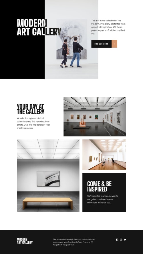
Nailed it! Everything seems so perfect and the responsiveness is fluid. The most beautiful thing here is the behavior of the h1 heading with the
mix-blend-mode
. Can you explain me how you've done that? Great effect.Congrats bro.
1@vanzasetiaPosted about 2 years ago@correlucas
Hi, Lucas! Thanks for your nice comment! š
For that effect which is reversing text color based on the background color, it works by doing the following.
- First, make sure the text color is the opposite color of the background color. In this case, the text color is white (
#fff
) and the background color is black (#000
). - Second, add
mix-blend-mode: difference
to theh1
.
Be aware that if the background color is not dark enough then the text color won't have enough contrast. For example, if the
background-color
is#1e1e1e
and the text color is#fff
, then the text color will be gray. As a result, the text color doesn't have enough color contrast.So, be careful with the color choice.
For more information, you can read this article, Reverse Text Color Based on Background Color Automatically in CSS | CSS-Tricks.
I hope this helps!
1@correlucasPosted about 2 years ago@vanzasetia Thank you for this complete feedback Vanza. I'm doing this challenge right now and I was wondering how to apply this effect. Now its much clear the idea. Thank you also for the other resources, really useful!
Have a nice day!
ššš
1 - First, make sure the text color is the opposite color of the background color. In this case, the text color is white (
- @EngineerHamzieyPosted over 2 years ago
š how was your exam? I guess you nailed it š. I was also wondering that I haven't seen your activities here in a while. And when I asked for your feedback on one of my solution the last time and I didn't see your reply, then I realized you must be busy with a project or something.
And thanks for the last feedback. It really helped.
Incase it's convenient, here is the link to that solution.
Although I already have some comments but I'm not satisfied š I still want yours.
0@vanzasetiaPosted over 2 years ago@EngineerHamziey My exam was doing great. Thank you for asking! š
Thank you also for understanding me! I was a bit busy with my own stuff last month. š
Oh, I already gave you some feedback on the solution. Hope you find it useful! š
1
Please log in to post a comment
Log in with GitHubJoin our Discord community
Join thousands of Frontend Mentor community members taking the challenges, sharing resources, helping each other, and chatting about all things front-end!
Join our Discord