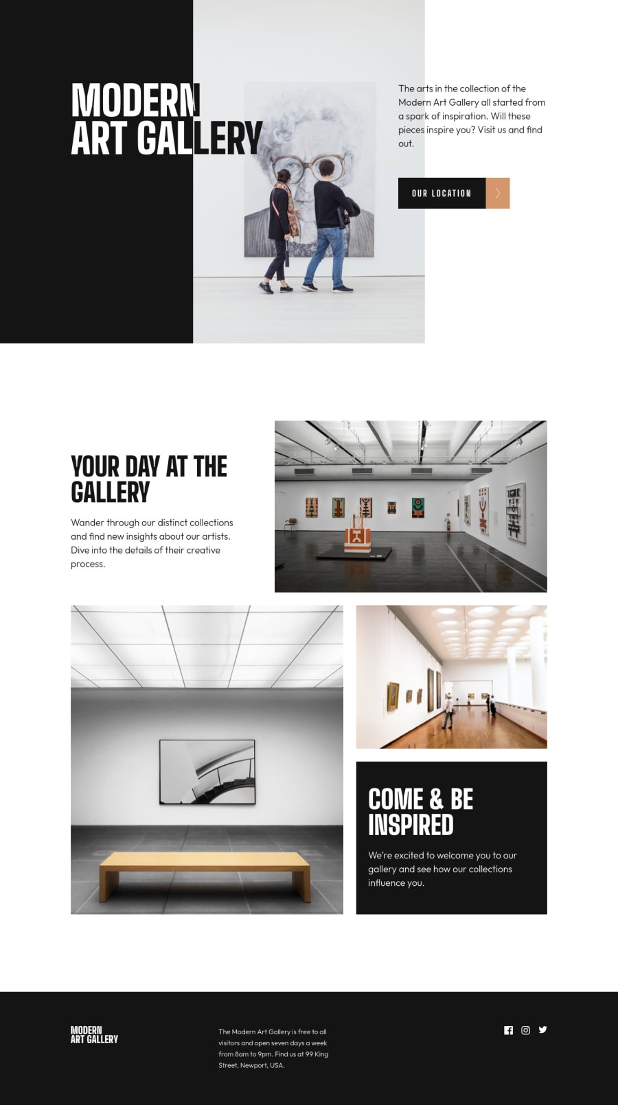
Art Gallery solution using responsive, leafletjs and many css tricks
Design comparison
Solution retrospective
The Art Gallery homepage provided several challenges that didn't seem "junior":
- the white/black text on the desktop hero section requires much CSS trickery involving duplicating the text, calc() offsets and clip-path: inset().
- the map is using the LeafletJS library as suggested. The grayscale appearance required !important to override a leaflet CSS class with greater specificity.
- the map custom marker was exported as svg from the Figma design and then incorporated inline in the javascript to render on the map.
- the map defaults to using jestures for zoom on mac and ios. This makes the location page not easily scrollable. I changed the options to disallow two finger zoom in order to make scrolling the default.
- responsive layout was complicated by the design choices that led to reordering and refactoring html.
- accessibility was tested with keyboard and voiceover on mac. The hero title caused some surprises here when the screen reader read the title twice. This led to using aria-hidden on the white/black styled heading and including a visually-hidden h1 specifically for the screen reader.
Community feedback
- @grace-snowPosted almost 2 years ago
This looks really nice!
Just a few things...
- having a repeating h1 is never a good idea. I wonder if there is a different way around that, like using aria-labelledby instead pointing to the text in a span
- you are using forms and buttons for navigation when you should just be using anchor links. That's what they are for
- there are some repeating alt descriptions in this
- it's not great for performance to load two stylesheets unnecessarily. Concatenate them into one
- all of your svgs are already accessibly labelled (or their wrapping elements are) so you need to make them aria-hidden true and focusable false. This will prevent some screenreaders from announcing them as images and from focusing on them. (Same with the marker icon on the map)
- 99 king street makes no sense as a heading... It's a paragraph. Or could be part of an address element.
Marked as helpful0@jefcooperPosted almost 2 years ago@grace-snow Thanks. Really appreciate the feedback as always. You're definitely helping me understand accessibility more.
For form/button combo, are you suggesting I use an <a href> and style it to look like a button? So when it is navigation use links and forego the button in html.
I got lazy on the alt description, but yeah, I can see even here the repeating would be disconcerting if I didn't know what's on the page. So even in this contrived case, make each one say something different.
0@jefcooperPosted almost 2 years ago@grace-snow I've addressed your comments with code changes. The screen reader is much happier now. The only suggestion I didn't address is the css in separate files. For that, I'm planning to switch to scss with a github action and more elaborate build for my next project (or the one after).
Would really appreciate if you could take a second look and verify if I am doing things as expected. Thanks.
0
Please log in to post a comment
Log in with GitHubJoin our Discord community
Join thousands of Frontend Mentor community members taking the challenges, sharing resources, helping each other, and chatting about all things front-end!
Join our Discord