Design comparison
Solution retrospective
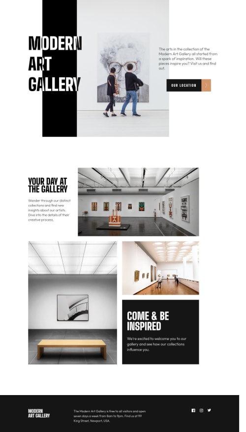
Please leave feedbacks. Thanks. My major design flaw is the contents stay on top left and not responsive very well at certain sizes. If you know how to fix these problems, feel free to leave a comment. Peace! :)
Community feedback
- @ChamuMutezvaPosted almost 3 years ago
Hi Fay
- That's nice. well done. The alt value is good . Some words that you can omit when writing alt values includes image, icon, graphic etc. These words or similar are automatically read by assistive technology when an image is encountered. Download NVDA to get a feel of what happens behind the scenes.
- the desktop looks awesome too
- here is an article that can help you with when to use rems, ems and px
- since the svgs are decorative images , include an
aria-hidden: true
so that assistive technology can ignore them
Happy coding
Marked as helpful1 - @ChamuMutezvaPosted almost 3 years ago
- write alt values that are beneficial to assistive technology users. An alt value should enable users who cannot see visualize the message that is carried by the image.
- do not skip headings, they should follow a sequential order, with an h1 being the first heading element.
- I might be missing something in reference to the use of
tabindex
. An anchor element is keyboard focusable by default as an interactive element, but I see you have addedtabindex=0
. - the mobile and tablet looks good, the desktop still needs to be polished. Part of the reason is that the media query of min-width 1440 is way off for most devices. My desktop is about 1360px.
- an anchor element should have readable content, an image inside an anchor is not text. You can use aria-label or a span element with a css Sr-only class (research on it)
- fixed sizes like px should be avoided where ever possible especially with your fonts. Using rems and ems is much better
Marked as helpful1@nottohavePosted almost 3 years agoHi @ChamuMutezva,
_ I have added alt values. _ I replaced one heading with div. I think that's the reason why the error about missing in the report showed. _ The tabindex was added because I thought anchor being a button role does not have key focus. But after I tested it, the key works without tabindex so I have removed it. _ I have polished the desktop by adding 1 more query to it. It is a quick hack. It tells me that I really need to go back to learn when to use rem and em. I also have trouble when to use min, max-width and the same thing with height. _ I also added aria -label to the anchor. However, or other element like div has the background image added, I can not add aria-label to them because it is not allowed. I do not know if there are other ways to explain to assistive tech users beside changing div to image, but that will break the web so I stay with div.
_ If you have time, please feel free to check this again and leave me more feedbacks. I think I did the best I could. But maybe more feedbacks would always be better for improvement. Thank you, I hope you have a great week.
0
Please log in to post a comment
Log in with GitHubJoin our Discord community
Join thousands of Frontend Mentor community members taking the challenges, sharing resources, helping each other, and chatting about all things front-end!
Join our Discord