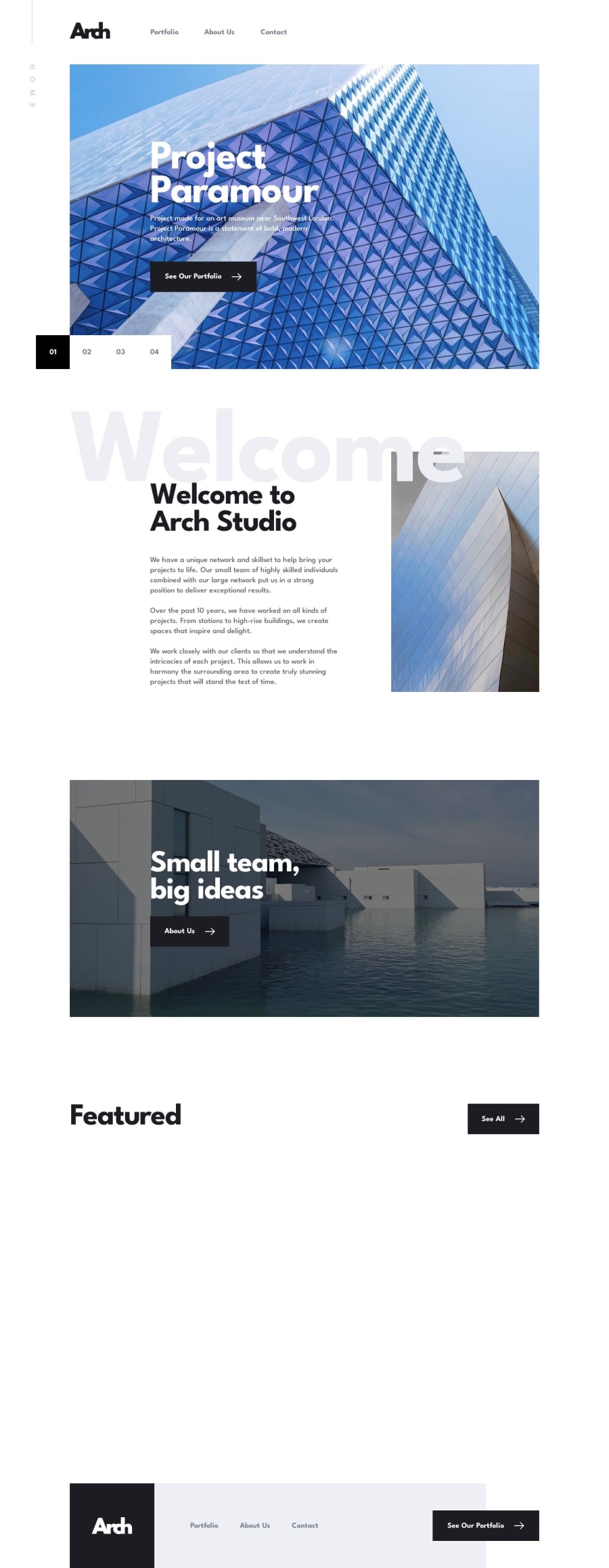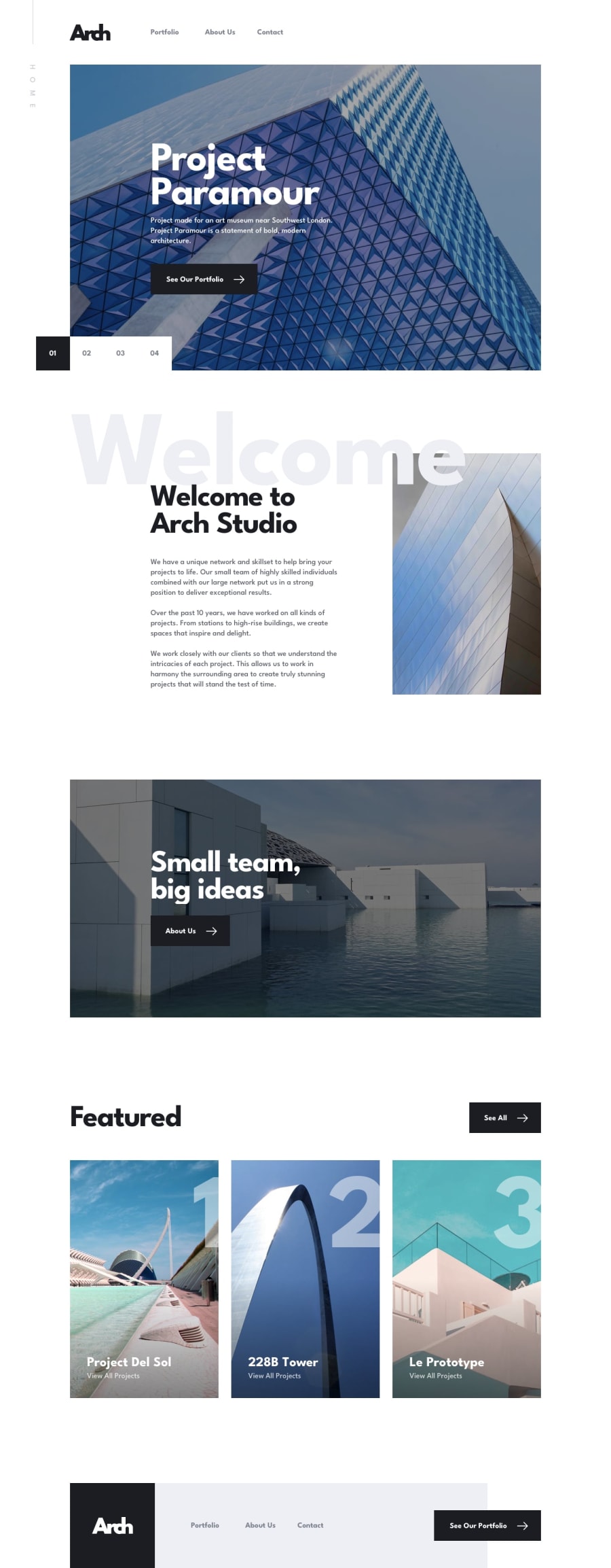
Design comparison
SolutionDesign
Solution retrospective
It was difficult to maintain consistency with the webpages. I wanted to transition all webpages from desktop to tablet in the same viewport width, but because the design required me to keep a lot of padding on the sides, I was forced to transition some elements to tablet before other elements.
As for the image carousel, I used framer-motion to create the carousel in the landing page. It took a while to make the carousel work, but it paid off in the end.
Community feedback
Please log in to post a comment
Log in with GitHubJoin our Discord community
Join thousands of Frontend Mentor community members taking the challenges, sharing resources, helping each other, and chatting about all things front-end!
Join our Discord
