Arch Studio Mobile First LeafletJS SCSS and Aos for animations
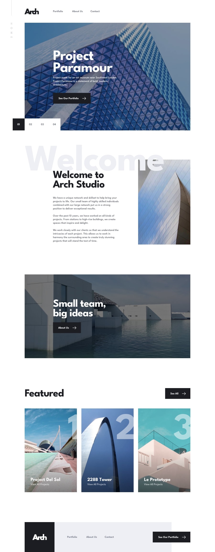
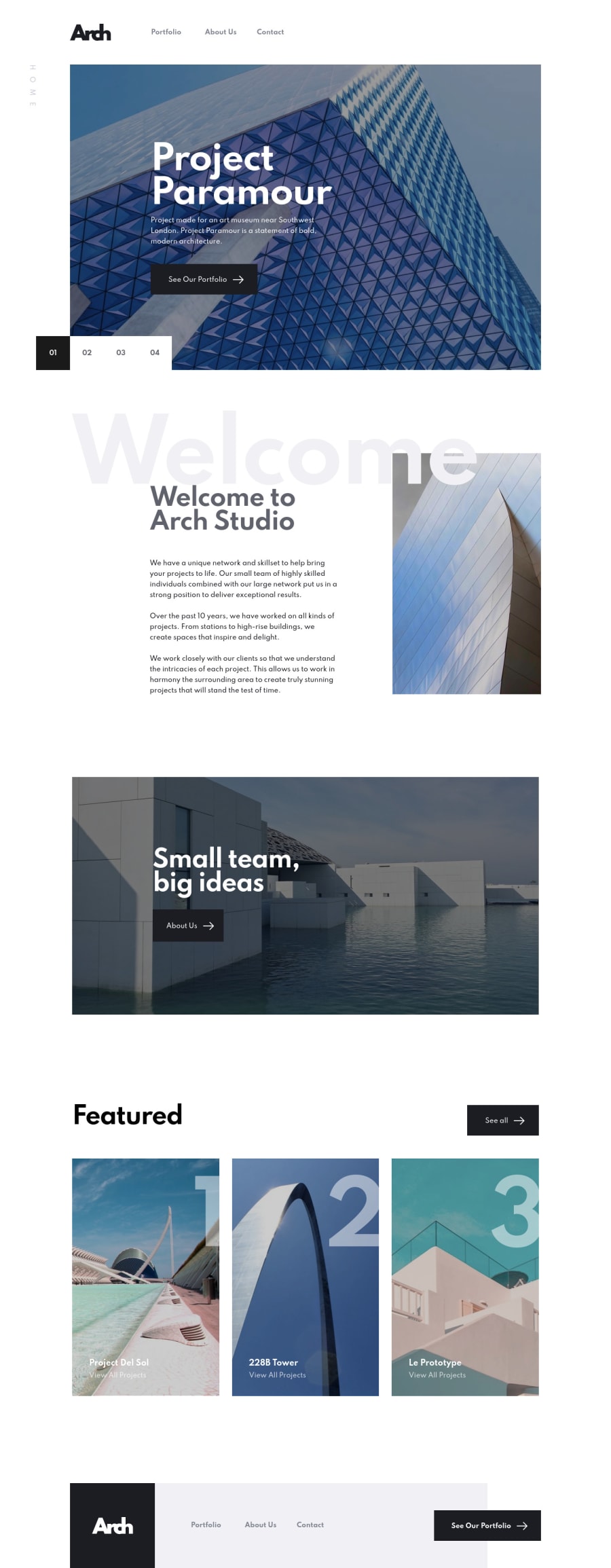
Design comparison
Solution retrospective
Hello guys!😁
For this project I decided to use SCSS for the first time, it definitely helped, I really like the nesting feature, I find that it is really useful and helpful, however, I think that I could use functions and mixins more often to cut down on repeating some styles .
Any feedback or suggestions would be appreciated!
Happy Coding 💻
Community feedback
- @ApplePieGiraffePosted over 3 years ago
Hi, Elliot Case! 👋
Amazing work on this challenge! 🙌 I think your solution looks great and responds well and I really like the animations that you added! 😀 You've done a great job in matching the design preview, too! 👍
The only small thing I suggest is adding
object-fit
to some of the images (such as the images in the slider in the hero section of the home page) so that they are clipped (rather than stretched or squeezed) when the size of the screen changes. 😉Keep coding (and happy coding, too)! 😁
0 - @grace-snowPosted over 3 years ago
Hi Elliot
Can you please turn off animations for those of us that prefer reduced motion please? This is really triggering for me so I can't look at it much.
Is this a new challenge by the way? I've not seen this one before.
It looks like you've done well with it, anyway. It's just the animations that are too much for me
0@ElliotCasePosted over 3 years ago@grace-snow
Hi Grace,
My bad, that was something that I completely missed and will think about in the future/ brush up on web accessibility. Animations are now turned off for users that prefer reduced motion! :)
2@grace-snowPosted over 3 years ago@ElliotCase thanks!
It's one of those things you have to be really careful animating big chunks of content.
Josh Comeau has some great writing about animation principles.
And another accessibility standard is you're always meant to offer controls to users of content animates. So a carousel should be pausable and have buttons to control. (I'm aware that's not included in the design though, so not your bad!) 😂
The carousel change is still a bit fast for me to read, but so so much better without the animations, so thank you ☺
0
Please log in to post a comment
Log in with GitHubJoin our Discord community
Join thousands of Frontend Mentor community members taking the challenges, sharing resources, helping each other, and chatting about all things front-end!
Join our Discord