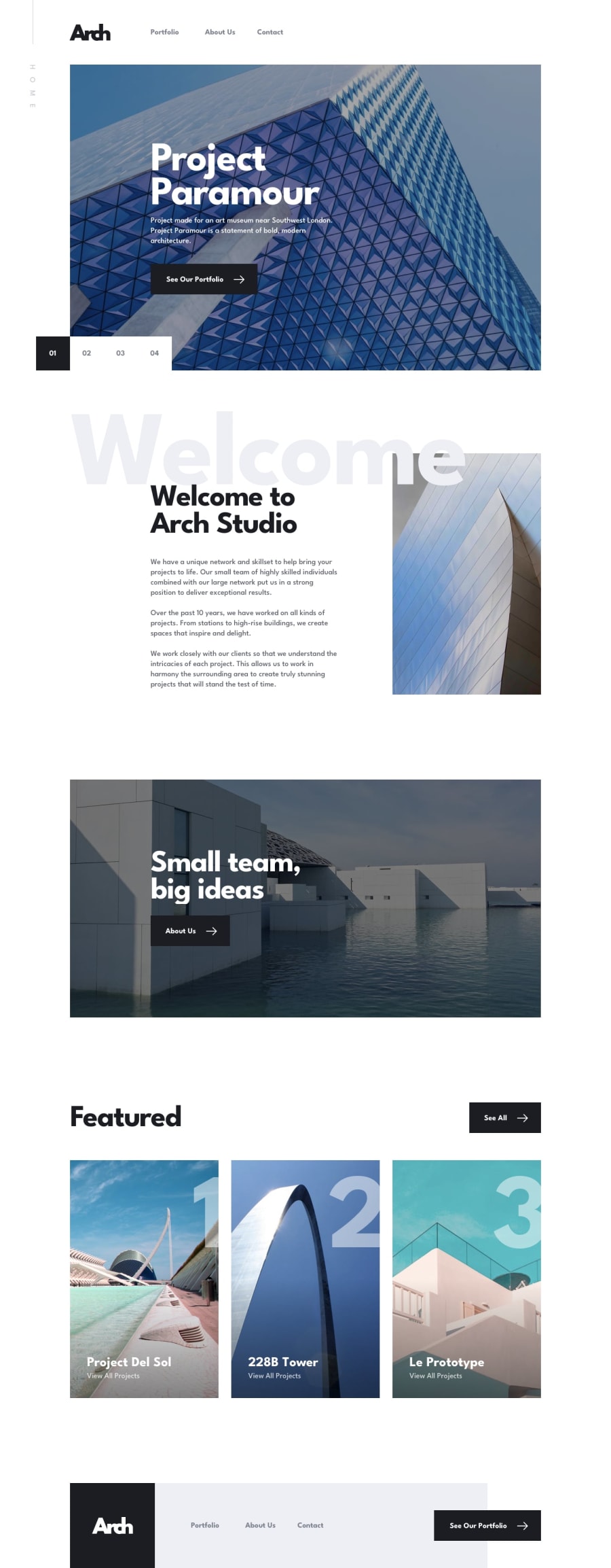
Design comparison
Solution retrospective
This was a good challenge to practice on React Router v6. I enjoyed the build and am glad I was able to achieve most of it. There is still room for improvement and I will appreciate any feedback. Thank you.
Community feedback
- @ApplePieGiraffePosted almost 2 years ago
Greetings, Eric Khang'ati! 👋
Good work on this challenge! 👍
As your solution report suggests, make sure to wrap all
lielements in aulorolelement and make sure that all direct children ofulorolelements arelielements. For things like navigation links, you should put the link tags inside of thelielements, like this,<ul> <li><a href="/">Home</a></li> </ul>I'd also like to suggest taking another look at the responsiveness of your site, as not all of the content of the page can be seen because it gets cut off around 450px (before the layout becomes mobile friendly).
And if an element takes the user to another page (for example, the "About us" link on the home page), there is no need to wrap it in a
buttonelement (just a link tag should do).Hope you find these suggestions helpful. 😊
Keep coding (and happy coding, too)! 😁
Marked as helpful0@erickhangatiPosted almost 2 years ago@ApplePieGiraffe Hello there. Thank you for your feedback. Let me get into it and solve those issues.
0
Please log in to post a comment
Log in with GitHubJoin our Discord community
Join thousands of Frontend Mentor community members taking the challenges, sharing resources, helping each other, and chatting about all things front-end!
Join our Discord
