Submitted over 4 years ago
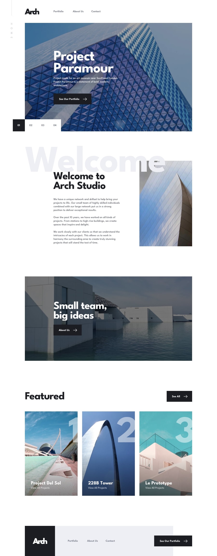
Arch Studio multi-page website | built with Sapper and siema carousel
@zuolizhu
Design comparison
SolutionDesign
Solution retrospective
Feedbacks are welcome!
Community feedback
- @bashirogluPosted over 4 years ago
Hi @zuolizhu, this looks amazing. Only thing I noticed, in the form section inputs somehow crapped from the top. especially with "f" it looks clear what I want to say.
1@zuolizhuPosted over 4 years agoHey @bashiroglu,
Thank you for checking out my project 😆I just fixed that crapping with the adjusted line height😎.
0
Please log in to post a comment
Log in with GitHubJoin our Discord community
Join thousands of Frontend Mentor community members taking the challenges, sharing resources, helping each other, and chatting about all things front-end!
Join our Discord
