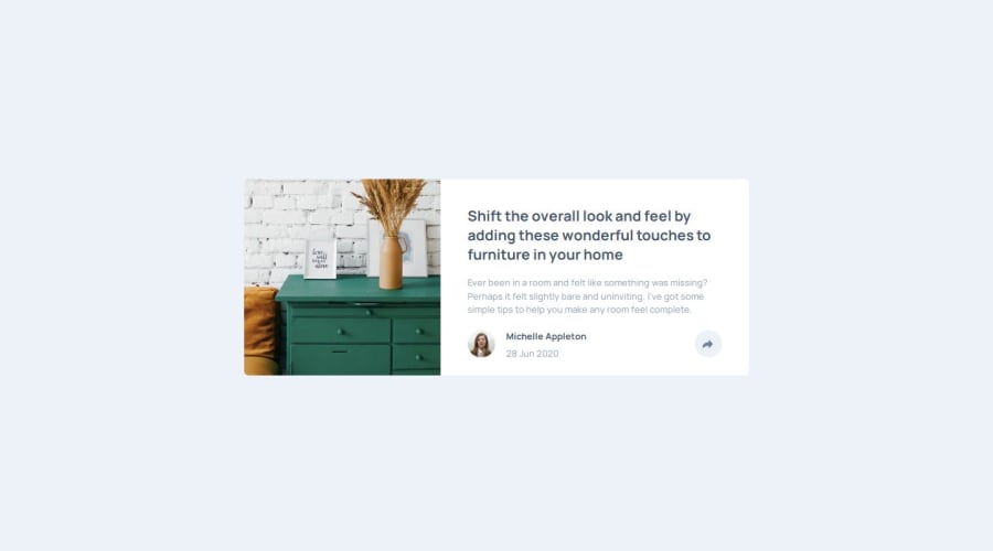
Design comparison
SolutionDesign
Community feedback
- @john-miragePosted 12 months ago
Hello, nice work
Here some ways you can improve your project:
- The button has no hover effect
- The social media links have no hover effects
- You should add a feature that close the tooltip when you click outside of it.
- You should add a button for the share button instead of a div so users can select and open the tooltip with a keyboard.
1
Please log in to post a comment
Log in with GitHubJoin our Discord community
Join thousands of Frontend Mentor community members taking the challenges, sharing resources, helping each other, and chatting about all things front-end!
Join our Discord
