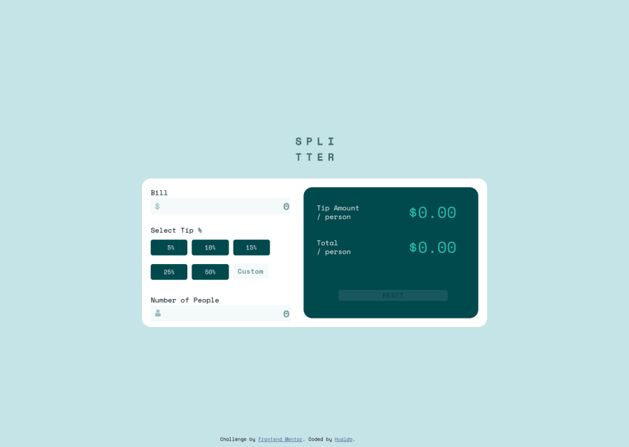
Design comparison
Solution retrospective
I´d like to know how to get that at the moment I change an input, automatically calculate; I´d tried with focus but it not work immediately.
Community feedback
- @oliveridsPosted over 3 years ago
Hey, i think your question can be solved with an EventListener!
Add a listener for the "input" event on the bill input. The "input" event catches any and all changes made on the value of said input. After you've done this, you can make all functions work when the browser notices any changes.
Your code would look a bit like this:
let billinput = document.getElementById('bill');
billinput.addEventListener('input', () => { ** all the calculation functions ** )
Marked as helpful0 - @pikapikamartPosted over 3 years ago
Hey, awesome work on this one. Desktop layout seems good, but it is not responsive at the moment, try to change the width until you hit the mobile breakpoint, the layout has been completely hidden. Mobile layout's breakpoint could be adjusted, because you only use like 375px as the breakpoint where lots of mobile phones have a wider screen compared to that. Starting from mobile first approach will help you solve some of this.
Some other suggestions would be:
- Never absolute a large container especially when it contains your main content. Try inspecting the layout, hover on the either
htmlorbodytag, there is no height since the content is out of the flow. - Since you are using only the
positionto center the content, it would be better this way. First remove all these on the.general:
position
top
left
transform
Then on the
bodytag add these:align-items: center; display: flex; flex-direction: column; justify-content: center;This way, you avoided using
positionprops. But as I do this, I noticed you are using absolute on the input icons,position: relativeis not being used in here.- Always have a
mainelement to wrap the main content of your page. On this one, the.containershould be using themaininstead ofdiv. - Website-logo
imgshould be using the website's name as thealtlikealt="splitter". Remember that a website's logo is meaningful so always make sure it uses the properaltvalue. - Those input-icons could have just been used as
background-imageof theinputto avoid using unwantedimgtag, also, you are using it wrong. Since you useimg, you should have position that relative to the input-container so that it won't be scattered on the site like it is doing now. Avoid as muchposition: absoluteusage. - Add a
minon theinput type="number". - You don't use
font, I haven't seen that though,ptag would be nice replacement. - The
select tipshould either be heading tag or alegendtext-content iffieldsetis took as an approach on the selections. - Use
buttoninstead ofinput type="button"why alter an element if there is already an element present. - Just
buttongroups is not enough. Instead, use a list ofbuttonon this one. If you were to usebuttonyou would need to have anaria-liveelement that will announce the certainbuttonhas been pressed or selected, becausebuttonalone is not informative. I haven't tackled this challenge yet so I can't give a reference of mine for this one. - The custom-input lacks a
labelto it , it would be a screen-reader onlylabelthough, another workaround is to usearia-labelfor it. - Your
number of peoplelabelis associated to the wrong-input, it should be linked on theinputbelow it and not on the custom-input. tip amountandtotalcould use a heading tag since they give information on what the section would contain.- When wrapping a text-content do not just use
divto wrap it, use meaningful element like aptag if it just a regular text or heading tag if it is an heading. - Use
buttonon the reset, usingdivmakes the component not accessible. Remember, interactive components uses interactive elements. By usingdivyou are making it not-accessible.
But still, aside from those, great job on this one.
Marked as helpful0 - Never absolute a large container especially when it contains your main content. Try inspecting the layout, hover on the either
- @HualDevPosted over 3 years ago
thanks!!! I will consider your comments and try to change.Your feedback help me to get better.
1
Please log in to post a comment
Log in with GitHubJoin our Discord community
Join thousands of Frontend Mentor community members taking the challenges, sharing resources, helping each other, and chatting about all things front-end!
Join our Discord
