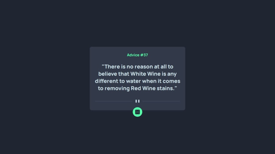
Design comparison
Solution retrospective
it was fun :)
Community feedback
- P@ilyesabPosted about 1 year ago
Hi @victorJandreu, Great Work!
I taken a look at your code. it looks like you did a good job. a few notes about it from my side are:
-
first on a mobile screen such as 375px wide. the content overflows the main container. it looks like from your CSS that you took a mobile first approach. the divider svg is 295px wide on mobile whereas the main container is 269.25px. so overflow happens. however on screens wider than 440px your design doesn't overflow.
-
Second is your JS Code. it seems like you don't add semicolons at the end of your javascript statements. Javascript does add them automatically if you omit them. however in some certain cases it can lead to errors that are hard to debug. so a general advice is to always add them manually.
Marked as helpful0@victorJandreuPosted about 1 year ago@ilyesab thank you so much! For the next projects I will take that in account! Thank you again for takes your time to look the code and gime feedback :)
1P@ilyesabPosted about 1 year ago@victorJandreu No problem. I also learn by reviewing the code of others.
0 -
Please log in to post a comment
Log in with GitHubJoin our Discord community
Join thousands of Frontend Mentor community members taking the challenges, sharing resources, helping each other, and chatting about all things front-end!
Join our Discord
