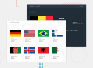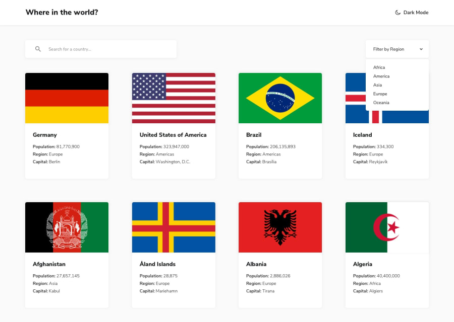
Design comparison
SolutionDesign
Community feedback
- @egstarPosted 11 months ago
Good job, You just need to add some missing things, to get the project works as per documents,
CSS
- Missing font family with the required font as per documents,
- Gap between rendered boxes to get the exact result with 4 columns per row,
- Card height must be sized to 100% of row so the cards might be displayed at the same height / width
- Country page missing styling as it shows the data without a rendering style
- Themes must be set for dark/light views
JS
- Missing theme switching function.
- Country borders must be displayed with Names not the alpha3Code and they might be clickable to redirect to the border's page
any way, good work so far, and Good luck.
0
Please log in to post a comment
Log in with GitHubJoin our Discord community
Join thousands of Frontend Mentor community members taking the challenges, sharing resources, helping each other, and chatting about all things front-end!
Join our Discord
