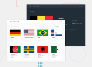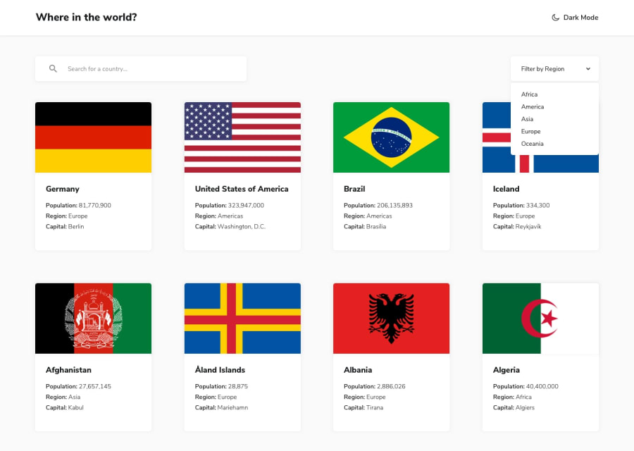
API Countries with React
Design comparison
Solution retrospective
Hello, guys!
I am particularly proud of my transition from junior to advanced projects. One project, in particular, was highly challenging but immensely rewarding. It pushed me out of my comfort zone and provided substantial opportunities for growth and development. Throughout this project, I honed my skills, tackled complex problems, and delivered a solution that met the high standards of an advanced project. This experience not only deepened my technical expertise but also enhanced my problem-solving abilities and confidence in handling more sophisticated tasks.
Reflecting on the project, one area where I see room for improvement is in the codebase. While the project was a success, I would aim to reimplement it with a focus on minimizing code complexity. Simplifying the code would enhance maintainability, readability, and overall efficiency. By adopting a more streamlined approach, I believe the project could have been even more robust and easier to work with, which would ultimately benefit both the development process and future enhancements.
What challenges did you encounter, and how did you overcome them?Challenges Encountered and How I Overcame Them:
Layout Challenges with Display Grid and Flex: One of the primary challenges I faced was improving the layout of the project using CSS Grid and Flexbox. Initially, aligning components and creating responsive designs proved to be complex and time-consuming. To overcome this, I took the following steps:
Research and Learning: I dedicated time to study advanced layout techniques and best practices for CSS Grid and Flexbox through online resources, tutorials, and documentation.
Experimentation: I experimented with different layout configurations and properties to understand their effects and find the best solutions for the project’s needs. Refactoring: I iteratively refactored the layout code, applying incremental changes and testing their impact on different screen sizes and devices to ensure a consistent and responsive design.
Integrating and Managing Routes with React Router: Another significant challenge was implementing and managing routing with React Router. Configuring routes and ensuring that the navigation between different components worked seamlessly required a thorough understanding of the routing library.
By addressing these challenges with a combination of research, hands-on experimentation, and iterative improvements, I was able to enhance both the visual presentation and functionality of the project. These experiences not only improved my technical skills but also contributed to the overall success of the project.
What specific areas of your project would you like help with?Hello everyone!
I'm currently working on a project and would greatly appreciate your feedback and assistance on a few specific areas of the layout, particularly regarding the buttons and the Details section.
Problem: I'm having trouble applying dark mode to the buttons.
Thank you in advance for your help! Your feedback will be invaluable in improving the quality and usability of my project.
Community feedback
- P@TedJenklerPosted 4 months ago
Hi @MachadoA,
Nice project! I love this one because there's so much to learn in a single project. Here are a few suggestions to enhance it even further:
Custom Select Element: Consider learning how to create a custom select dropdown. This would allow you to add animations, like rotating arrows and hover effects, to match the design more closely. It’s a great way to improve both your CSS and JavaScript skills.
Search Bar Design: Nice job with adding the "X" to the search bar! Just a small tip—consider removing the outline when the search bar is focused. This can help maintain the clean look of your design.
Translating Border Names: Consider using JavaScript to translate country border codes (e.g., "FRA") into their full names (e.g., "France"). This would improve user experience and is a great challenge for working with data—it’s more complex than it seems
Search Bar State Management: I noticed that when you search for a country, navigate to its page, and then go back, the search bar still has one country selected. Consider to clear the search when navigating away t.ex implementing a useEffect to reset the search state under certain conditions. This would make the navigation smoother for users.
Otherwise, great job with the grid layout and overall design! Continue the great work.
Best, Teodor
Marked as helpful0@MachadoAPosted 4 months ago@TedJenkler
Hi Teodor,
Thank you so much for your thoughtful feedback and suggestions! I’ve made some of the changes you recommended, and I really appreciate your insights.
However, I’m still facing some challenges with handling dark mode. Do you have any additional thoughts or tips on how to approach this?
Thanks again for your help!
Best regards, Ana Amaral
1P@TedJenklerPosted 4 months agoHi again @MachadoA,
When you want dark and light theme functionality, you basically need a way to save the state through re-renders, some state that can be passed down to all components, and a button to change the state. I see you've used the Context hook to achieve the "global state," and the only thing you seem to have forgotten is to save it through re-renders. You can do this with localStorage.setItem() and localStorage.getItem().
If you want to learn more, I would recommend looking into Redux Toolkit. Even though it seems scary at first, it makes handling global state so much easier.
*I would always try to split the problem you have into smaller parts and figure out how to achieve it. This method has worked for me, and I’ve learned a lot of advanced topics like filter search and debounce using it.
0@MachadoAPosted 4 months ago@TedJenkler Hi Teodor,
I wanted to update you on the dark mode issue. After further investigation, I realized that the problem wasn’t with the code logic or state management itself but with how the CSS selectors were applied. Instead of using localStorage as initially planned, I found that I needed to ensure the dark-mode class was correctly applied to the body element. This approach allowed me to update the CSS selectors and ensure that dark mode was applied consistently across different components.
I’ve updated the App.css to reflect these changes, and this adjustment resolved the issues I was experiencing. I chose not to implement Redux to keep the focus on refining my use of useContext, which helped me better understand the context API and how to manage global state within React.
Thank you for your support and suggestions. If you have any further advice or insights, I’d be glad to hear them.
Best regards, Ana Amaral
1
Please log in to post a comment
Log in with GitHubJoin our Discord community
Join thousands of Frontend Mentor community members taking the challenges, sharing resources, helping each other, and chatting about all things front-end!
Join our Discord
