Gatsby, SEO, Animation, Transition, Fluid Typography
Design comparison
Solution retrospective
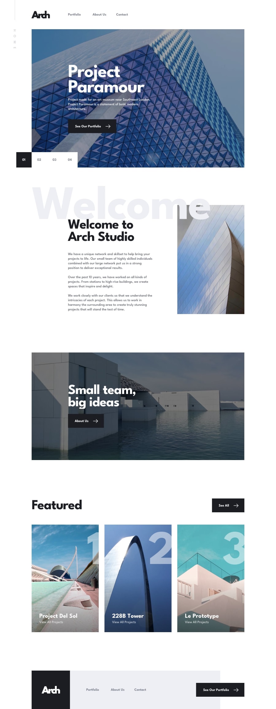
At the end of July, I don't even know the box-model and even the basics of CSS and I challenge myself to learn it and comparing my early submissions to this one, I can say that I have improved a lot.
This submission is the manifestation of all the things that I learned up to this day.
This still has a lot of imperfections though like the footer and possibly some spacings.
Any feedback is greatly appreciated. Thank you for viewing my submission 😁
Community feedback
- @ApplePieGiraffePosted about 4 years ago
Wow! Incredible job, Francis Luigie Quenano! 🙌
I love the animations and the mobile navigation in your site! 😍
Your solution looks great and responds well, too! 👍
Perhaps just consider taking a look at your solution report since there are quite a lot of issues there. 😉
Keep coding (and happy coding, too)! 😁
1@flquenanoPosted about 4 years agoThank you for the feedback 😁, the issues is mainly on the <Link> of gatsby and and some image issues, gonna work at it later.
0
Please log in to post a comment
Log in with GitHubJoin our Discord community
Join thousands of Frontend Mentor community members taking the challenges, sharing resources, helping each other, and chatting about all things front-end!
Join our Discord
