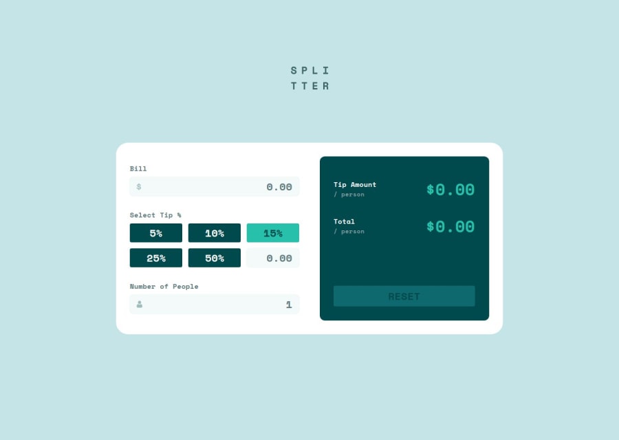
Design comparison
Solution retrospective
The main feature of this project is the ability to automatically calculate the tip and total bill based on user inputs. The calculation logic is implemented in JavaScript, ensuring precise results and real-time updates as users interact with the input fields.
Next time, I plan to build this challenge completely from scratch using React.js.
What challenges did you encounter, and how did you overcome them?♿️ 1. Accessible Validation
- Problem: The app must remain accessible during user input validation.
- Solution:
- ✅ Implementation of accessible validations.
- ✅ Clear and informative error messages.
- ✅ Tested on different devices to ensure an inclusive experience.
💡 2. Interactive Visual Feedback
- Problem: Need to implement hover and focus states for all interactive elements on the page.
- Solution:
- ✅ Use of CSS pseudo-classes
:hover
and:focus-visible
. - ✅ Ensured consistent visual feedback on buttons and fields.
- ✅ Improved usability and accessibility of the app.
- ✅ Use of CSS pseudo-classes
💻📱 3. Responsive Layout
- Problem: The layout must be optimized for different screen sizes.
- Solution:
- ✅ Implemented media queries to adjust the layout.
- ✅ Used relative units (such as
%
, andrem
) to ensure scalability. - ✅ Applied Flexbox and CSS Grid to create a flexible and adaptable layout.
- ✅ Tested on various devices to ensure proper viewing.
💰 4. Precise Tip Calculation
- Problem: The app must accurately calculate the tip and total cost per person.
- Solution:
- ✅ Implemented precise calculation functions in JavaScript.
- ✅ Ensured that results are displayed clearly and understandably.
I would like to receive feedback on the:
- Accessibility approach I have adopted.
README.md
as seen by recruiters or employers.- Or any other feedback you may have. 😊👍
Community feedback
- @grace-snowPosted about 2 months ago
It's really important you don't change aria labels like this! Input labels must match the visible label otherwise you get a label in name failure (the field won't work for voice control users any more). Look up the wcag criterion understanding docs to make sure you understand why this is so important.
The logo must also say "splitter". The aria-label on that home link (which is unnecessary to have at all as this is a single page web app) should say "Splitter - Home" nothing else.
I think listbox is a strange choice for the tip amounts honestly. I'd need to test that to understand how it works. If expect this to be a fieldset of radios with the last one triggering an input for the custom amount. Even if you do use a different approach though the aria labels must match exactly what is there visibly (which means aria-labels aren't needed at all as they already have text in there).
On the output panel those text elements shouldn't all be headings. Headings only make sense if they are acting as titles for the content that comes after them. So you could have a visually hidden heading for the "results" section, but headings dont make sense for the values.
Marked as helpful1@alberto-rjPosted about 2 months agoThank you for your feedback @grace-snow, great recommendations have been noted and I will certainly refactor my solution when I have availability. Thanks again. 👍😊
0@alberto-rjPosted about 2 months agoSubject: Clarification on ARIA Labels and Form Accessibility
Hi @grace-snow,
Thank you for the detailed feedback. The 4 points you raised were very insightful, and I understand the need for adjustments, particularly regarding ARIA labels and the structure of the form.
However, I would like to clarify my approach regarding the first point about input labels and ARIA. The reasons I initially adopted this method were as follows:
- Form validation: I need to ensure that form validation is clear and accessible to all users.
- User guidance: It is important that users know in advance what type of input is expected in each field.
- Design constraints: Unfortunately, the provided design lacks clear visible labels for the inputs.
Given these constraints, what would be the best way to ensure accessibility, especially for voice control users, while still guiding users on what is expected in each field? Is there a recommended approach in this situation where the design doesn't explicitly provide labels?
Thank you again for your guidance, and I look forward to your advice.
Best regards, Alberto
0@grace-snowPosted about 2 months ago@alberto-rj there are visible labels on all inputs in this design.
- Bill = label
- select tip = legend
- 5% 10% etc = labels
- custom = label
- number of people = label
If a design doesn't include a visible label but uses a placeholder you would make the label text say the same as the placeholder (but the designer would need challenging as that would still cause a different accessibility failure because the field becomes unlabelled for people with cognitive or memory impairments)
1@alberto-rjPosted about 2 months agoYes @grace-snow!
You are right, there are visible labels on all inputs in this design. I apologise for the lack of clarity in my previous message. What I meant to say was that "there are no visible descriptions about what is expected as valid input in each field in the design."
My goal is to ensure that users know in advance what is expected in each field of the form to avoid input errors. For example:
-
Bill: "Enter total bill amount, between 0 and 9999 pounds"
-
Custom Tip: "Enter a custom tip percentage, between 0 and 100 percent"
-
Number of People: "Enter number of people splitting the bill, between 1 and 100"
My question is:
How can I ensure that this information is clear and accessible for all users (including those using voice control), without relying on validation errors to guide them?
Is there a recommended approach for presenting these descriptions, since they are not visible in the design? I’d like to understand how to improve this guidance while maintaining accessibility and user experience.
Thanks again for your patience and guidance.
0@grace-snowPosted about 2 months ago@alberto-rj they are completely unnecessary.
Marked as helpful1@alberto-rjPosted about 2 months ago@grace-snow thank you for your reply. I understand that you mentioned that these descriptions are unnecessary, but I'd like to better understand why, especially in the context of accessibility and user guidance.
As I said before, my goal with these descriptions was to help users understand what is expected in each field, avoiding possible input errors.
Could you explain to me why they are not necessary and what the best approach would be to ensure that users have this information in an accessible and clear way, especially those who use voice control or have cognitive difficulties?
0@grace-snowPosted about 2 months ago@alberto-rj over communicating is just as bad as under communicating. All these fields need is labels, there really is no more to it than that! That is all that's needed to be able to fill out the form.
You can do things like use inputmode so people see the best mobile keyboard and pattern attribute to limit what can be entered but you don't need to add extra instructional text.
Accessibility isn't about giving extra information it about giving an equitable experience. If everyone else can fill out the form without lots of extra information then it will be no different for voice control or any other modality.
Marked as helpful1@alberto-rjPosted about 2 months ago@grace-snow thanks for clarifying! I now realise that communicating too much can be just as damaging as communicating too little, and that balance is key to offering an accessible experience.
I will focus on simplifying communication and ensuring that the labels are sufficient, without overwhelming users with unnecessary additional information.
Once again, thank you very much for your time and guidance.
Happy coding! 😊 👍
0 - @1deadjoePosted 2 months ago
This is impressive. I would like to learn from you. The use of transitions for the totals is a very nice addition. Kudos. I will get here someday.
1@alberto-rjPosted 2 months agoHi @1deadjoe,
Thanks, it's good to know that my solution was useful to you. Feel free to get in touch when you need to learn more about it, or just to say hello.
0
Please log in to post a comment
Log in with GitHubJoin our Discord community
Join thousands of Frontend Mentor community members taking the challenges, sharing resources, helping each other, and chatting about all things front-end!
Join our Discord