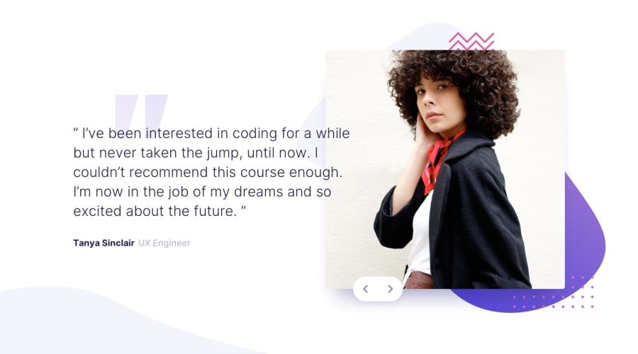
Design comparison
Community feedback
- @mattstuddertPosted over 4 years ago
Awesome work on this challenge, Alex. Your solution matches up really well to the design and scales down nicely to mobile 🙌
The only tiny thing I would mention (and this is me being very picky 😅) is to add
cursor: pointerto the navigation buttons. This should always ideally be used as a hover state for clickable elements.Keep up the great work! 👍
1@alex-kim-devPosted over 4 years ago@mattstuddert That's a 100% fair point, i've just fixed it. Thanks for the review!
I'm also very excited that you mentioned this solution in the weekly newsletter, I even got my first Github star after that :)
1@mattstuddertPosted over 4 years ago@Alex-K1m awesome! 🥳 You deserve it. It’s a great solution! 💯
1@Buggy-ATLPosted over 4 years agoRound of applause! This is the best looking solution for this one I've seen so far. I've been tinkering with it for weeks and it's killing me just trying to figure out the right way to scale the typography. They shouldn't have labeled this one as a "newbie" challenge!
0
Please log in to post a comment
Log in with GitHubJoin our Discord community
Join thousands of Frontend Mentor community members taking the challenges, sharing resources, helping each other, and chatting about all things front-end!
Join our Discord
