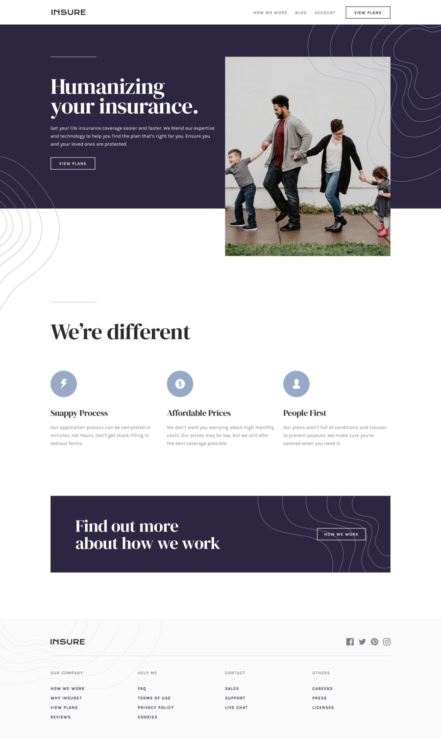
Design comparison
SolutionDesign
Solution retrospective
What are you most proud of, and what would you do differently next time?
I did this challenge so I can apply the while in view animation effect, It's not quite perfect 😂 but I am glad of the progress I have made so far! The layout is a bit tricky, especially on the mobile viewport!
I am always aiming for pixel perfection and clean code
Community feedback
Please log in to post a comment
Log in with GitHubJoin our Discord community
Join thousands of Frontend Mentor community members taking the challenges, sharing resources, helping each other, and chatting about all things front-end!
Join our Discord
