Animated Rating Component in React
Design comparison
Solution retrospective
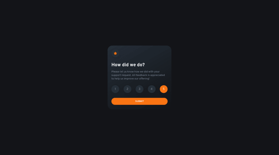
It starts with a loader animation, once you get to Thank You page, you can click on Thank you again to go back and forth between two pages/states.
A challenge i've done while ago, so i'vent changed the old code, (e.g. conversion from px to rem etc) but i've just added some animations today.
Community feedback
- @CornflakesPlusPosted over 1 year ago
Unique design, clean code, smooth render, "Alive" component, and overall amazing display. I'll have to implement some styles from here. Loved the gradient effect on the card, it feels like sunlight coming from the moving curtain. :D
May I ask, how long have you been a web developer (years of experience)? and could you recommend any online tools or courses to learn about web development?
0P@visualdennissPosted over 1 year ago@CornflakesPlus Hey, thanks a lot for your feedback! The sunlight association is a great analogy that didn't come to my mind actually! Creative way to look at it, love that.
I've started my journey in 2021 from scratch. I've never done courses, instead i've watched many youtube videos and practiced along, for example i tried to build websites or implement my own ideas trying to apply the knowledge gained from videos.
1 - @DeolabestPosted almost 2 years ago
Hey , Congratulations on completing this challenge!
Here is my feedback:
-
The thanks page doesn't have the option to rate again.
-
5 star rating is selected by default which shouldn't be the case.
NB: I just started learning JS and I'm checking out some related projects here.
Keep doing a good job!
0P@visualdennissPosted almost 2 years ago@Deolabest Hey Adeola,
thanks for your time and feedback.
"The thanks page doesn't have the option to rate again"
- There is no rate again option in the original design, however i've had already included a way to go back and forth to rate again for demo purposes. If you check my "Questions for Community", i've already pointed it out in bold text. But for real world applications, rate again would not make sense.
"5 star rating is selected by default which shouldn't be the case."
- Well, that is not in the design, however it was my own decision to have a default selection, which is a common practice on the web as a way of suggestive marketing. It is completely optional, you may or may not use this strategy.
Nice, good luck on your web journey with JS!
0 -
- @riteshkumarldhPosted almost 2 years ago
wow very cool animation
0
Please log in to post a comment
Log in with GitHubJoin our Discord community
Join thousands of Frontend Mentor community members taking the challenges, sharing resources, helping each other, and chatting about all things front-end!
Join our Discord
