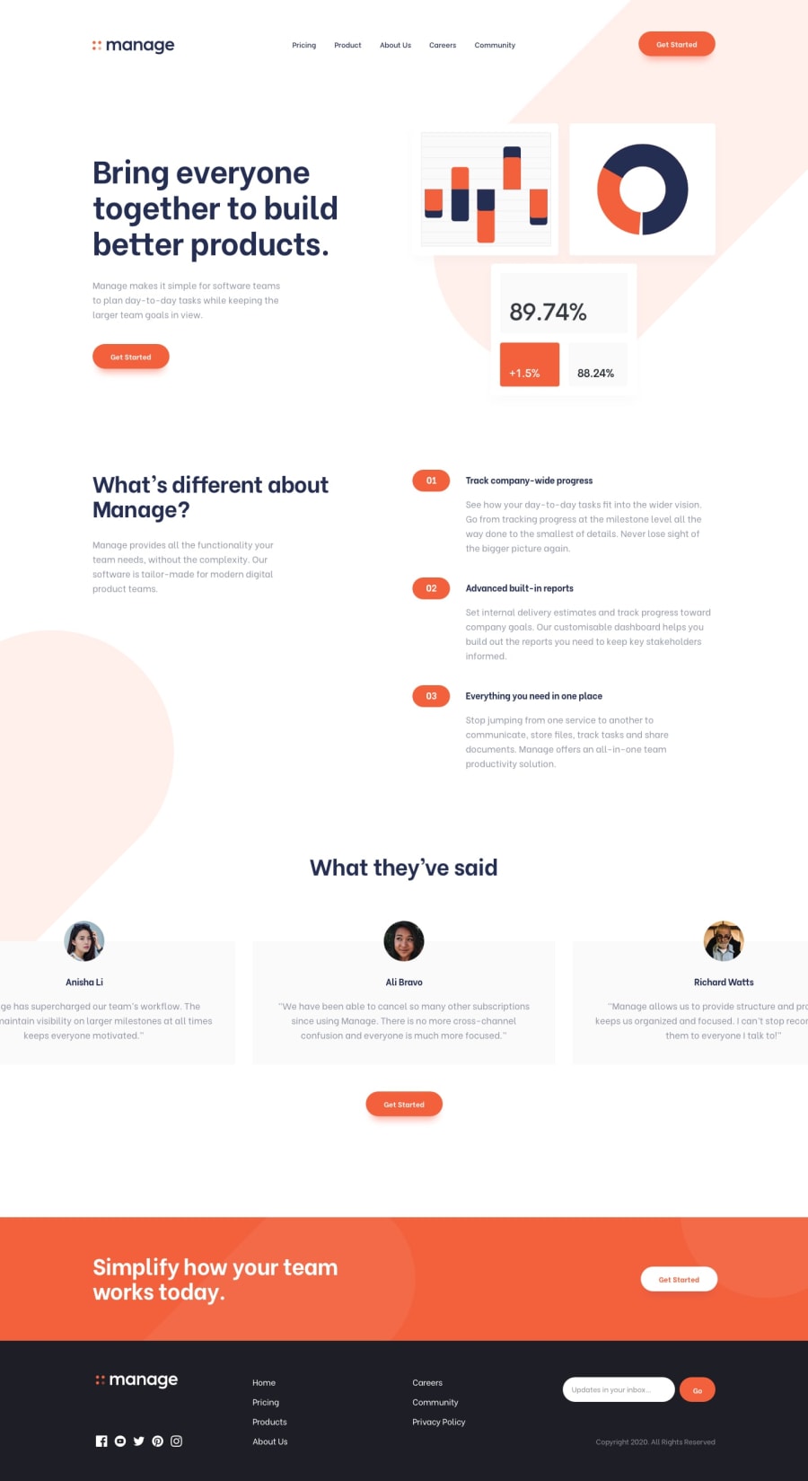
Design comparison
SolutionDesign
Solution retrospective
What are you most proud of, and what would you do differently next time?
Well, this was a bit tough to tackle but I am generally happy with the outcome!🙂
I noticed the illustration SVG is slightly different and so is the typography:
I had difficulties figuring out how the slider could work until I found a library called Swiper, which I used although positioning and aligning it was tough.
The content shifts made this challenge a bit challenging even though I managed to technically solve the problems but just not sure if my solution is efficient
Community feedback
Please log in to post a comment
Log in with GitHubJoin our Discord community
Join thousands of Frontend Mentor community members taking the challenges, sharing resources, helping each other, and chatting about all things front-end!
Join our Discord
