Submitted 11 months ago
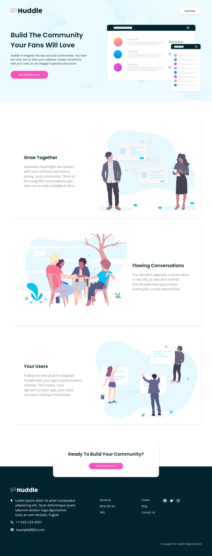
Animated Huddle Landing Page ✅✅ w/HTML, CSS, JS
#accessibility#animation#gsap#semantic-ui
P
@kodan96
Design comparison
SolutionDesign
Solution retrospective
What are you most proud of, and what would you do differently next time?
I was messing around with GSAP and ScrollTrigger , ended up animating the whole site 🤷♂️🤷♂️
Made with:
- Mobile-first development 📲📲
- HTML 🔸
- CSS 🔹
- JS 🟨
- used GSAP and its ScrollTrigger with Split-Type to animate 💨💨
- lenis took care of the smooth scrolling🧈🧈
Sadly it doesn't react well to screen-resize, if you have any idea how to fix it, you know what to do 👇👇
Community feedback
- @alex931dPosted 11 months ago
Nice solution 👍🏻 But i noticed a few things on mobil view
- The fade in text on the cards doesn’t fade correctly in and end up being on top of the text you may want to position the animation so that doesn’t happen.
Other then that great solution!👍🏻
Marked as helpful0P@kodan96Posted 11 months ago@alex931d
Thanks for pointing it out, I'll modify the animation later 🤙
0
Please log in to post a comment
Log in with GitHubJoin our Discord community
Join thousands of Frontend Mentor community members taking the challenges, sharing resources, helping each other, and chatting about all things front-end!
Join our Discord
