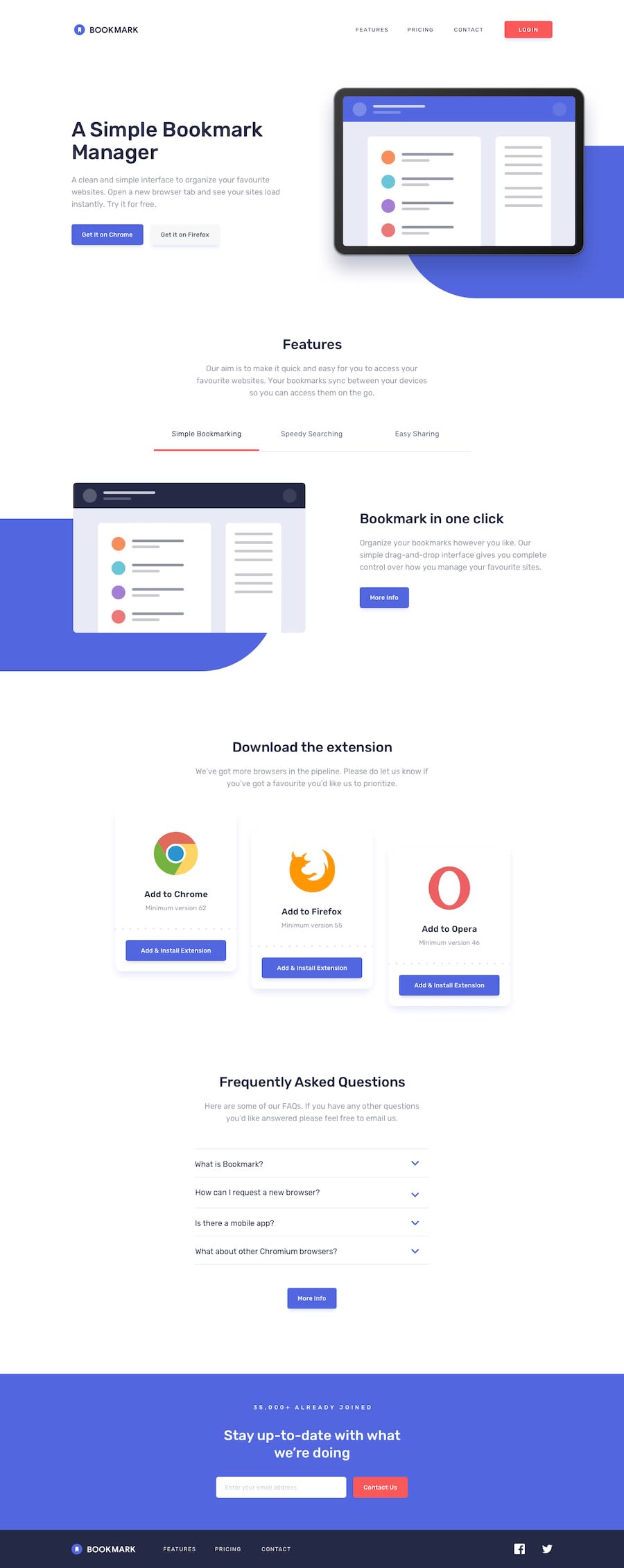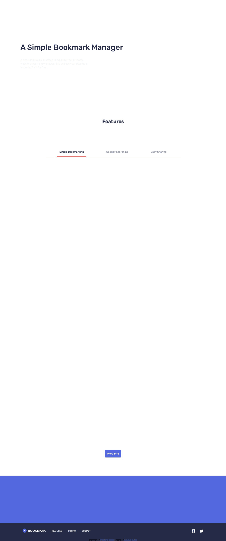
Design comparison
Solution retrospective
This is my first time using a scroll animation, it took me a while to figure out but I'm really glad that it turned out great ! 😁
This by far the best landing page that i have done, and i can't wait to make more amazing webpages and websites !
What challenges did you encounter, and how did you overcome them?The only challenge i faced was how to use the scroll animation
What specific areas of your project would you like help with?Well this is my first time doing scroll animation, so any suggestions on the transitions and delay and better approaches to scroll animation will be highly appreciated, Thanks ! ^_^
Community feedback
- @grace-snowPosted 5 months ago
I'm afraid the animations in this make it break accessibility requirements around reflow and resize. When I view on mobile it's very disorientating because the content keeps disappearing and reappearing as I scroll and try to read it. This becomes impossible if I enlarge the text size or view in landscape.
As a general rule, it's not great to animate whole blocks of content. It can be really bad for accessibility and SEO. But if you do ever animate blocks of content, make sure they only animate in then persist. Don't let them disappear again like it's doing now.
It's also generally really bad practice to use sticky header bars like this. Again, consider smaller phones, landscape or people who need larger text. A fixed big bar obscures so much content.
Also when I had text enlarged I couldn't access the nav at all because I was unable to scroll to reach it off the side of the screen.
Marked as helpful0@grace-snowPosted 5 months agoThere are also some big problems in the html on this. It's currently non functional and inaccessible. I recommend you take some time to really learn about good html structure. I can see you've done quite a few challenges already and if there are these kinds of foundational problems in this they are very likely to be present in previous challenges. I hope these tips help and you can go back through correcting them all as a html learning process.
- all content should be contained within landmarks. This design needs a header (with nav inside), a main and a footer.
- read the posts in the discord resources channel about how and when to write alt text on images. Alt is content not code. It shouldn't be hyphenated strings like class names.
- the mobile nav toggle must be a button with an accessible name and must be the first element inside a nav landmark. If you are treating the mobile menu as a modal dialog use the dialog element. If you are treating it as a disclosure (like an accordion) then follow an accessible disclosure pattern with aria-expanded.
- nav links must be links (anchor elements)
- don't capitalise in html, do that in css.
- the social links must be links and must have an accessible name. You must use interactive elements for pieces of a design that are meant to have interactive behaviour. This same point applies to other clickable elements throughout the design where you've used things like paragraphs.
- margin is how you create space between elements, not brs. The br element will be announced as "break" by some screen readers, depending on settings.
- don't add click events to non interactive elements. A tab pattern must use appropriate html and keyboard functionality. See the aria authoring practices guide for more info.
- the frequently asked questions must use the accessible disclosure pattern as already referenced in the article above.
- you're really misunderstanding heading levels I think. Try to think of heading levels as the contents page of a big document. If you use h5 it means it "belongs to" the h4 content above it, like its a subtitle of it. Try to make sure the heading levels in this solution communicate the content structure correctly.
- form inputs must always be labelled.
- an email input should use a type of "email" not "text".
- if the input is required it must have the required attribute.
- email is a common field that must have an autocomplete attribute with an appropriate value (email).
- the error icon must have an alt attribute. This should be left blank so its treated a s a decorative image.
- the error container should be programmatically linked to it's input. You do that with aria-desciribedby on the input pointing to the id of the error container.
- if you have two navs on one page, they must both be labelled. You can do this with aria-label eg "primary" and "footer".
- if using inline svgs you need to accessibly label it just as you would any other meaningful image. You can do this with a role of img and aria-label. If it was a decorative svg you'd add aria hidden true instead. Either way, inline svgs should include
focusable="false"
because some user agents include svgs in the focus order. - again, use links and make sure the socials have accessible names in the footer nav just like I mentioned for the header nav.
- you will need to update JS to reflect above feedback, but you also should not be using
var
anywhere. - overflow-x hidden will almost always cause accessibility problems for larger text sizes.
- get into the habit of including a full modern css reset at the start of the styles in every project. Andy Bell or Josh Comeau both have good ones you can look up and use.
- Font size must never be in px.
- don't style on IDS. It's not what they're for and can lead to maintenence nightmares on larger projects.
- buttons or links shouldn't have explicit widths. You can use min-width if necessary.
- you're using a lot of percentage widths which is a code smell. I'm away from my computer so can't test properly but that is very likely to cause bugs. I'd expect to see max widths in rem not so many percentage widths. - Similar with the gap property. Using percentage removes all control. Whereas you could be using px rem or even em for the gap property.
- use single class selectors as much as possible. Element selectors should only be used at the start of a project to set sensible default styles. For everything else put classes on what you want to style and use those as css selectors. Then the styles won't break even if you have to change html like heading levels or elements.
- never limit the height of elements that contain text like buttons or inputs. These would break for users with a different text size. Instead let the browser do it's job and decide what height is needed based on the content and any padding on the element.
- the mobile styles should be the default. And media queries must be defined in rem or em not px. This means the layout will scale correctly for all users including those who have a different text size setting.
- I would expect this challenge to only need one media query. The fact you've had to add so many should be ringing alarm bells and shows its caused by lots of other mistakes through styling approach like all the widths and heights.
Marked as helpful0@ZHADOW999Posted 5 months ago@grace-snow thank you so much for this, i will make sure to take note of all these corrections and improve :-)
0
Please log in to post a comment
Log in with GitHubJoin our Discord community
Join thousands of Frontend Mentor community members taking the challenges, sharing resources, helping each other, and chatting about all things front-end!
Join our Discord