Submitted 5 months ago
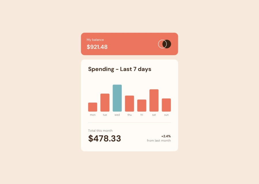
Animated & Dynamic rendered Expenses Chart with CSS Flex
@AtakanAKKAN
Design comparison
SolutionDesign
Solution retrospective
What are you most proud of, and what would you do differently next time?
The thing I am most proud of about the project is that when I first saw the project, it was very intimidating. It was the first time I used vanilla javascript with dynamic structure. Although it was easier with React, I wanted to test myself. Next time I would create the project with React.
What challenges did you encounter, and how did you overcome them?It was challenging to dynamically pull the values and provide the tile size according to the amount of money. Of course, it was fun at the same time because I learnt new things. It was also challenging to make money values appear with the hover effect.
Community feedback
Please log in to post a comment
Log in with GitHubJoin our Discord community
Join thousands of Frontend Mentor community members taking the challenges, sharing resources, helping each other, and chatting about all things front-end!
Join our Discord
