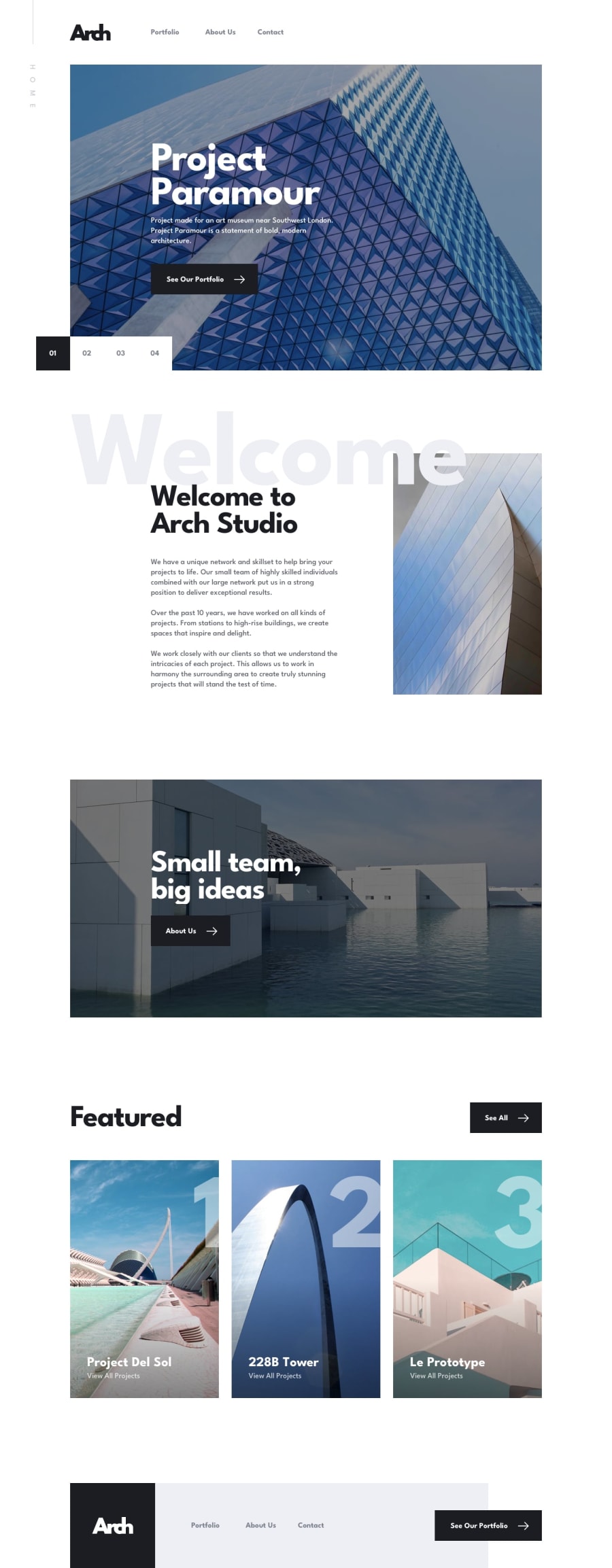
Angular | Tailwind | HammerJs | LeafletJs
Design comparison
Community feedback
- @codedforfreePosted over 2 years ago
Looks really awesome again! I like to look at your code I don't really work with angular. Maybe you can only extend your here intro a bit so it really looks pixel perfect ;)
Furthermore, what do you think about the HTML issues? I got them when I use something like alphine.js Are these really issues or should we ignore these in real projects?
Last thing. I noticed a z-index issue on your location map. Probably you need to increase the z-index on your navigation to keep it from sliding under your map.
Curious about your opinions and thanks for keeping me inspired!
Marked as helpful0@vandermsPosted over 2 years ago@codedforfree , thanks for your comment. Usually I set the navbar z-index at 99 and it works, but I didn't notice that the map has a higher z-index.
About the HTML issues, I don't care much about it. Angular (and Alpine also) are amazing frameworks and this validations shouldn't be a real concern.
The only problem is that it gets harder to use HTML validation tools since a real HTML error can be among the several fake ones and you ignore it, thinking that it's also not a real problem.
1 - @vandermsPosted over 2 years ago
Only when I was submitting this solution, I realized that I hadn't changed the website favicon. What is funny because the Angular favicon fits very well for the Arch Studio.
0
Please log in to post a comment
Log in with GitHubJoin our Discord community
Join thousands of Frontend Mentor community members taking the challenges, sharing resources, helping each other, and chatting about all things front-end!
Join our Discord
