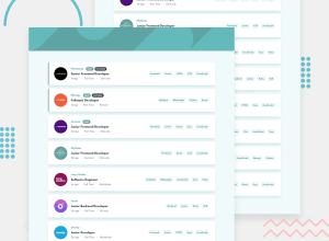
Design comparison
SolutionDesign
Solution retrospective
I finally finished this challenge.
I'm looking for issues in the usability of the page, like a breaking layout, missing features, or something like that.
Also, comments on the architecture or the code of the project will be very welcome!
There's one issue I'm specially looking for help: the fonts.
I'm not sure if my files are corrupted or it's something special about this font, but it looks like the text itself has a bottom margin of 3-4 px. Makes some elements like the New! and Featured flags look badly aligned.
Community feedback
Please log in to post a comment
Log in with GitHubJoin our Discord community
Join thousands of Frontend Mentor community members taking the challenges, sharing resources, helping each other, and chatting about all things front-end!
Join our Discord
