Angular Responsive Landing Page using Grid and Flex with Sass/Scss
Design comparison
Solution retrospective
Hello FrontEnd Mentors and *,
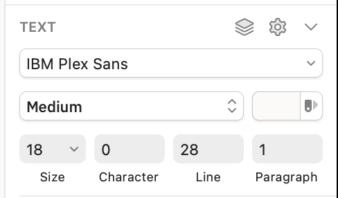
I would like to know if everyone has an exact correspondence between this (see image below) in Sketch and CSS.
I mean, how do you translate exactly into css Character, Line and Paragraph?
https://freeimage.host/i/lmin0x
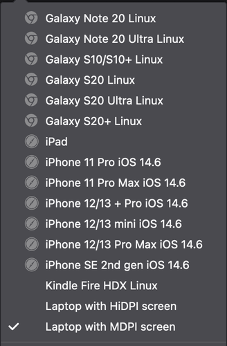
Any trick for hits different devices with media queries? I am really struggling when I have to check MDPI, HiDPI or my Macbook Pro 15' and everything with high resolution
https://freeimage.host/i/lmioUQ
Any help for future developments would be really appreciated it, happy coding!!!
Community feedback
- @arfarobsPosted almost 3 years ago
Hey Karim. I just completed this project. I used Figma as apposed to sketch.
To try and answer your question. I would assume that character stands for letter-spacing in this case it doesn't have a value. Line would stand for line-height and in your pictures case it would have a value of 28px. Paragraph stands for paragraph-spacing in your pictures case has a value of 1.
I hope I've read and understood your question properly.
Marked as helpful1 - @ackuserPosted almost 3 years ago
Hi Arthur, I appreciate your help.
For the fonts I end up doing this https://graphicdesign.stackexchange.com/a/106880/129627 in Sketch which I suppose it is going to give you the correct css.
Thanks
0
Please log in to post a comment
Log in with GitHubJoin our Discord community
Join thousands of Frontend Mentor community members taking the challenges, sharing resources, helping each other, and chatting about all things front-end!
Join our Discord


