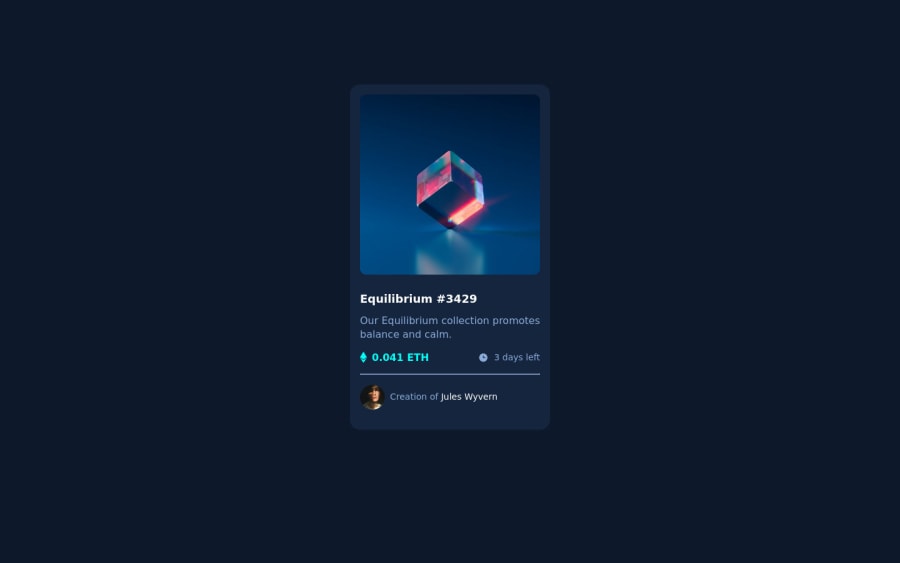


Design comparison

Solution retrospective
I faced these challenges while doing the nft preview challenge:
- Being able to change the nft image color to cyan while hovering on it. Well on this part, I was able to change it's opacity but changing its color was a different thing.
- being able to add a rounded colored radius around the avatar. One can achieve a border radius around the image by setting it to 50%, how can one also add a colored border radius ?
I appreciate any feedback, Thank you.
These challenges seem to always have something quite new under their sleeves.
Community feedback
- @correlucasPosted about 2 years ago
👾Hello @Rioba-Ian, Congratulations on completing this challenge!
Great code and great solution! I’ve few suggestions for you that you can consider adding to your code:
Here's how you can add the hover effect:
Container needed to position the overlay. Adjust the width as needed
.container {
  position: relative;
  width: 100%;
  max-width: 340px;
}
Make the image to responsive
.image {
  width: 100%;
  height: auto;
}
The overlay effect (full height and width) - lays on top of the container and over the image
.overlay {
  position: absolute;
  top: 0;
  bottom: 0;
  left: 0;
  right: 0;
  height: 100%;
  width: 100%;
  opacity: 0;
  transition: .3s ease;
  background-color: red;
}
When you mouse over the container, fade in the overlay icon
.container:hover .overlay {
  opacity: 1;
}
The icon inside the overlay is positioned in the middle vertically and horizontally .icon { color: white; font-size: 100px; position: absolute; top: 50%; left: 50%; transform: translate(-50%, -50%); -ms-transform: translate(-50%, -50%); text-align: center; }
When you move the mouse over the icon, change color
.icon-eye:hover { color: hsl(178, 100%, 50%, 0.5);; }👨💻Here's my solution for this challenge if you wants to see how I build it: https://www.frontendmentor.io/solutions/nft-preview-card-vanilla-css-custom-design-and-hover-effects-b8D1k9PDmX
✌️ I hope this helps you and happy coding!
Marked as helpful0@Rioba-IanPosted about 2 years ago@correlucas
Using some of the steps you've outlined, I was able to make a few changes that met the required solution very quickly.
-
I changed the container to position relative to allow for the overlay and the background image. This fixed a lot of the inconsistencies I had been experiencing earlier.
-
After checking out your solution. I saw quite a few things I don't know yet, for example: webkit frames, keyframes. I believe they are for animations. I would also like to know these things. If you could link me to some resources that you found really good and great to start with I will really appreciate.
Thank you so much for your feedback and the insight I got through looking at your challenge.
0 -
- @saakarxPosted about 2 years ago
Hello Ian Rioba, Congratulations on completing the challenge
- You can add the color over the image by creating an overlay using a psuedo-element like
.classname::afteror.classname::beforefor reference pseudo-elements. - To add the border you can use
border: 2px solid whiteyou have usedborder: #fff;you haven't specified the border width specifying it will create the avatar image border needed.
Hope this helps.
Marked as helpful0@Rioba-IanPosted about 2 years ago@saakarx Thank you.
- I added the border: 2px solid white and it worked.
0 - You can add the color over the image by creating an overlay using a psuedo-element like


Please log in to post a comment
Log in with GitHub
Join our Discord community
Join thousands of Frontend Mentor community members taking the challenges, sharing resources, helping each other, and chatting about all things front-end!
Join our Discord