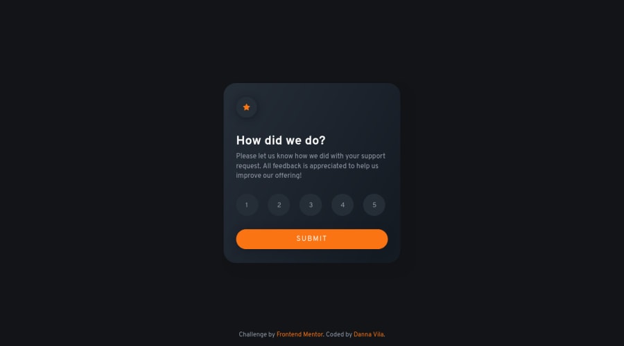
An interactive rating component developed with vanilla JavaScript
Design comparison
Solution retrospective
Hi! I just developed this interactive rating component with vanilla JavaScript, and I learnt a lot about accessibility, I read some articles related to this so I decided to use radio buttons for the options and I used css without losing accessibility. This article helped me through this, and I hope it can help more people as well.
I appreciate any feedback about my code. Thank you.
Community feedback
- @CyrusKabirPosted over 2 years ago
Hi @dannxvc, you did a good job on this challenge. your card have some problems both in code and accessibility.
1.Accessibility: at first I just try to test accessibility with just tab key and I didn't know for radio groups we should use tab + arrow keys. one hidden and weird bug is when some one want select rating number 1 at first with just keyboard it's hard I mean first tab key just can select our radio groups then we should iterate with arrow keys and if some one hit tab key at first for rating number 1 and then hit enter in thank you card there is no rating selected
2.CSS: you have some duplicates code in rating buttons implementing. like adding pseudo elements to label for just creating hover effects and for button itself. you can do all of them in label itself. one another duplicates is two different rules for
.options label
and both of them haveposition: relative
. I changed some duplicated codes and here is the result :.options input[type="radio"] { opacity: 0; position: absolute; } .options input[type="radio"]:checked + label { background-color: var(--primary); } .options input[type="radio"]:checked + label span, .options input[type="radio"]:focus + label span{ color: var(--white); } .options input[type="radio"]:focus + label{ outline: rgb(59, 153, 252) auto 5px; } .options label:nth-of-type(1){ margin-left: 0; } .options label:hover{ transition: .3s ease-in-out; background-color: var(--gray); color: var(--white); } .options label{ position: relative; display: inline-block; height: 3rem; width: 3rem; background: var(--blue-light); border-radius: 50%; padding: 0.5rem; cursor: pointer; justify-content: center; margin-left: 1rem; } span{ position: absolute; top: 50%; left: 50%; transform: translate(-50%, -50%); z-index: 1; color: inherit; font-size: 0.8rem; }
I still haven't found a solution for accessibility problem. but at all you did good job on having good accessibility with those radio buttons also I learned about how we should interact with radio buttons with keyboard. hope I could help you. good luck. ☻
Marked as helpful1@dannxvcPosted over 2 years ago@CyrusKabir Hi! I hadn't noticed that, thank you so much, I will check that out and read about it, I will let you know. If you find something related to this do not hesitate leaving a comment. Thank you about the css code as well, it looks cleaner, thank you so much!! I will definitely update it.
1@CyrusKabirPosted over 2 years ago@dannxvc your welcome, I am glad that was helpful.
0 - @ayouchanePosted over 2 years ago
I like that you chose to mark it up it as a form. That makes a lot of sense actually. It was my initial intention, but then I gave up on it and went for a list instead because I wasn't sure how much time the trial and error process is gonna take me had I went down that path, especially when it comes to overriding the styling of native browser element. But Now I can look at the implementation of someone who actually took the time to do it so thank you! And you got the design on lock too, awesome work!
1@dannxvcPosted over 2 years ago@ayoub-ahabchane This makes me so happy, I'm really glad I helped. Thank you!
1
Please log in to post a comment
Log in with GitHubJoin our Discord community
Join thousands of Frontend Mentor community members taking the challenges, sharing resources, helping each other, and chatting about all things front-end!
Join our Discord