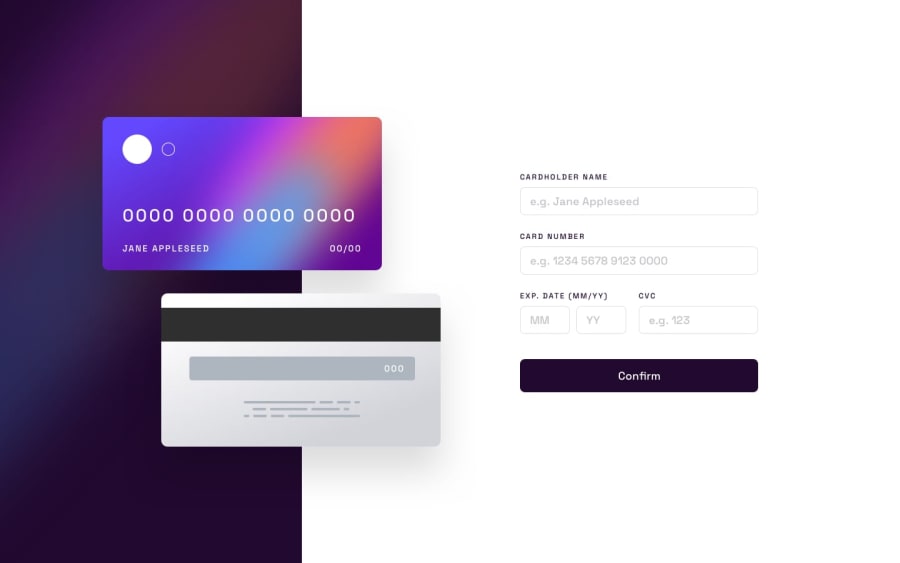
Design comparison
Solution retrospective
Hey! If you have some feedbacks about my solution feel free to comment below! =)
Community feedback
- @AdrianoEscarabotePosted about 2 years ago
Hi Kadu Magalhães, how are you?
I really liked the result of your project, but I have some tips that I think you will enjoy:
- every Html document must contain the main tag, so we can identify the main content, to fix this, wrap all the content with the main tag. HTML5 landmark elements are used to improve navigation experience on your site for users of assistive technology.
- We have to make sure that all the content is contained in a reference region, designated with HTML5 reference elements or ARIA reference regions.
Example:
native HTML5 reference elements:
<body> <header>This is the header</header> <nav>This is the nav</nav> <main>This is the main</main> <footer>This is the footer</footer> </body>
ARIA best practices call for using native HTML5 reference elements instead of ARIA functions whenever possible, but the markup in the following example works:
<body> <div role="banner">This is the header</div> <div role="navigation">This is the nav</div> <div role="main">This is the main</div> <div role="contentinfo">This is the footer</div> </body>
It is a best practice to contain all content, except skip links, in distinct regions such as header, navigation, main, and footer.
Link to read more about: click here
The rest is great! i really like the details that you put in the button!
I hope it helps... 👍
Marked as helpful0@kdumagalhaesPosted about 2 years agoHi @AdrianoEscarabote !
Thanks a lot for your tips! I've just done what you told me! Accessibility is a very important subject for us web developers!
0
Please log in to post a comment
Log in with GitHubJoin our Discord community
Join thousands of Frontend Mentor community members taking the challenges, sharing resources, helping each other, and chatting about all things front-end!
Join our Discord