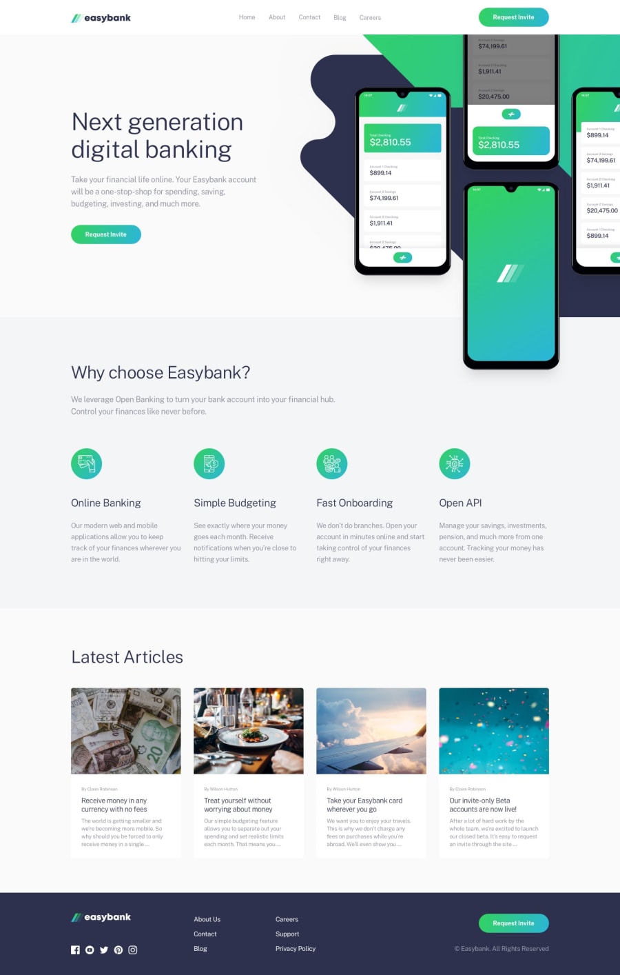
an animated react banking landing page
Design comparison
Solution retrospective
OMG you guys, I just finished another solo React project building this gorgeous Easybank landing page and can I get a high five?! 🖐️ Got those slick animations going, components breaking things into reusable bits - I'm basically a pro-React developer now! 😎
But let's get real - accessibility was kinda my weak point if I'm honest. 🤓 I was nerding out hard about toggle interactions and hover states when I should've been asking: but what about screen reader users?!
So I've gotta work on my inclusivity game for sho! Here's some ways I can have MORE fun (!) while making sites that work for errbody:
🔤 Semantic HTML is my BFF (but like cooler than my actual BFF maybe?)
🎨 Ooh baby those color contrasts are SPICY and accessible!!🌶️
📽 Alt text for images - now screen readers can enjoy my glorious creations too!
There's always more to learn when it comes to web access I know, but I'm so jazzed to keep improving. Because the web is for EVERYONE, am I right or am I right?? 🙌
My code organization is getting bonafide lit too - scoping CSS by component ftw! Less clashes than high school, woohoo! 💃 Sure I can tweak some things to share styles globally but I've come a long way from one messy CSS file, phew! 😅
So let me know if you've got tips for me my coding queens and kings! ✨ And high five to more inclusive and kick-butt websites for all users!! 🖐️🖐️ Raised hands AND hand clap emoji for the people in the back!! 🙌👏
Community feedback
- @enzo-mirPosted about 1 year ago
Awesome project the only things that i can say :
- There is a lack of spacing between elements and line spacing
- And careful to
tabindexbecause the application is not really accessible be keyboard
Well done this solution deserve compliments !
1
Please log in to post a comment
Log in with GitHubJoin our Discord community
Join thousands of Frontend Mentor community members taking the challenges, sharing resources, helping each other, and chatting about all things front-end!
Join our Discord
