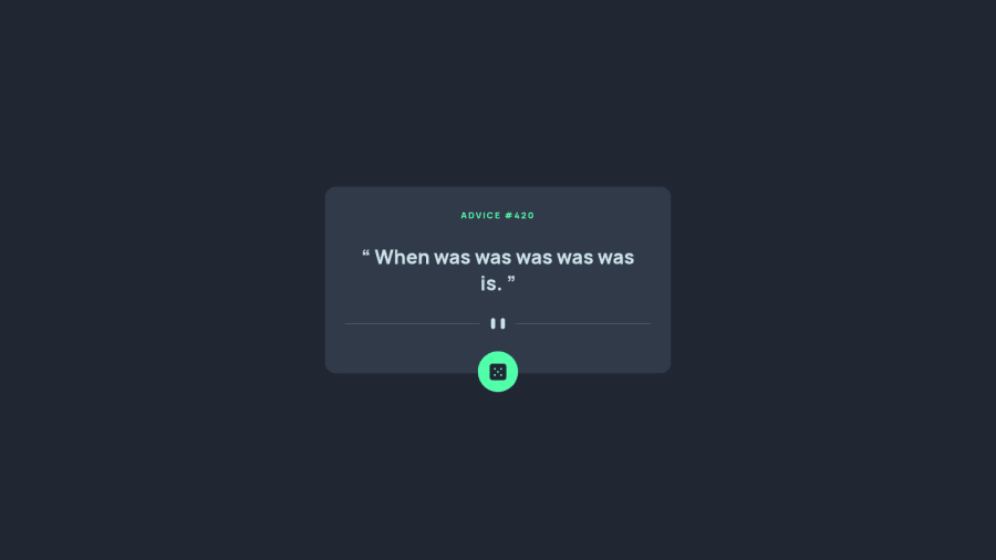
Design comparison
SolutionDesign
Solution retrospective
This was a fun challenge. Open to any suggestions as the CSS is bit of a mess.
Community feedback
- @RioCantrePosted over 2 years ago
Hello there! Awesome work with this project. Looking at your solution, I think you should know the following as well…
- The HTML structure is looking great. You utilized the semantic tags well
- Some of the images
althave description. You can add the rest like this line<img class="divider__mobile divider__img" src="./images/pattern-divider-mobile.svg" alt='"'>but not priority - The design is looking great. You used the exact color values of the background and main content.
- The main button is functional. It generates random quotes when I click on it
- The alignment of the fonts and images is looking great
- The CSS file is well structured
- Great job also with the responsive design
Advice #160
"Enjoy a little nonsense now and then."
Above all, the design is well implemented. Keep up the good work!
Marked as helpful1
Please log in to post a comment
Log in with GitHubJoin our Discord community
Join thousands of Frontend Mentor community members taking the challenges, sharing resources, helping each other, and chatting about all things front-end!
Join our Discord
