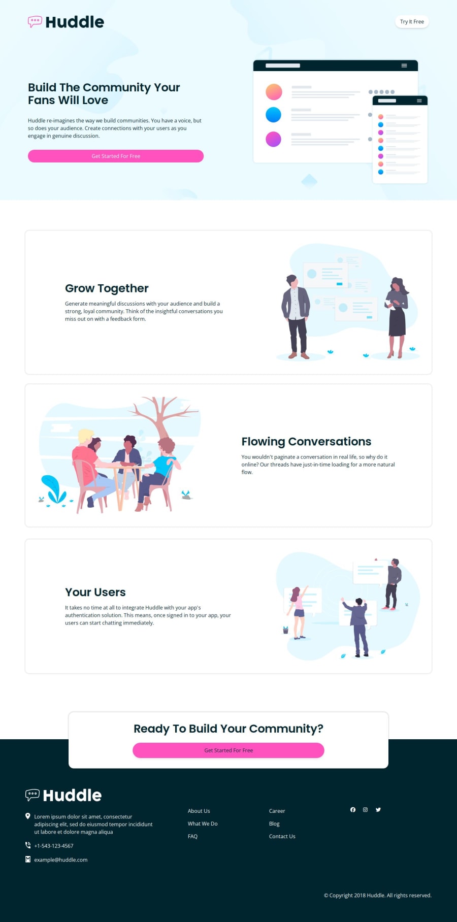
Alternative huddle landing page
Design comparison
Solution retrospective
- complete with Tailwind CSS
- making layout flex and grid
- learn positioning
- I have faced a challenge in the footer
- It's hard to make an absolute positioning
- It's time to go footer
- Header is an amazing part
- and a pop-up card in the footer
Community feedback
- @DannimationsPosted about 1 month ago
Well, I think you submitted the project in the wrong place, but I understand what you were trying to do.
For starters, you can try changing the appearance of the buttons and links when they're being hovered over, to give some sense of user functionality.
You can achieve something like that using the 'hover' state attribute in the css
button:hover{ }and then put the properties of the hover in the curly braces.
Then for the footer, I had issues with it before, but I think you nailed it. Just use a basic flexbox for the layout, and if the div's are put in the right place, everything kinda falls into place automatically.
Hope this helps:)
0
Please log in to post a comment
Log in with GitHubJoin our Discord community
Join thousands of Frontend Mentor community members taking the challenges, sharing resources, helping each other, and chatting about all things front-end!
Join our Discord
