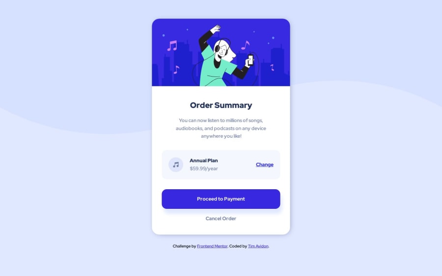
Order summary component w/ (HTML + CSS)
Design comparison
Solution retrospective
I'm open to feedback.
thanks,
Community feedback
- Account deleted
For the background image something like this is viable (for desktop view)
body {
  background-color: hsl(225, 100%, 94%);
  background-image: url(images/pattern-background-desktop.svg);
  background-repeat: no-repeat;
  background-size: contain;
}
As for the responsiveness of the design, using a max width on the card container will keep it from stretching and deforming, since you used responsive width on the card component itself, it won't go over the max width you set but will still center on desktop view.
I'd also suggest changing the height and width to vh instead of rem units as rem is based of font size and not viewport size.
Marked as helpful1
Please log in to post a comment
Log in with GitHubJoin our Discord community
Join thousands of Frontend Mentor community members taking the challenges, sharing resources, helping each other, and chatting about all things front-end!
Join our Discord
