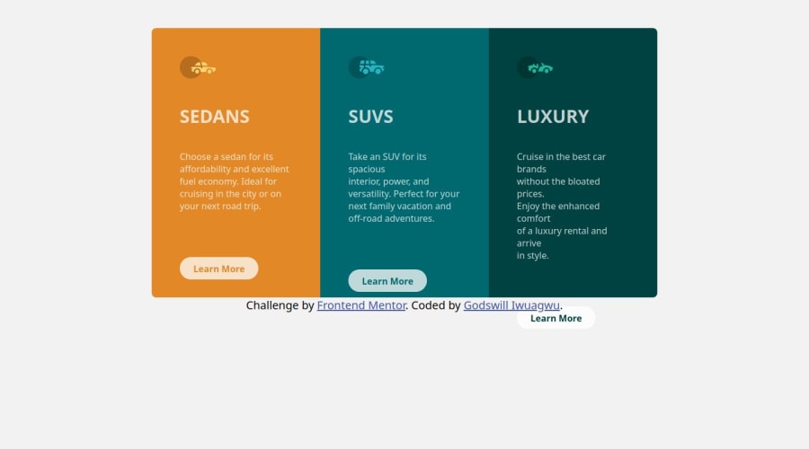
Design comparison
SolutionDesign
Solution retrospective
What are you most proud of, and what would you do differently next time?
am good on this
What challenges did you encounter, and how did you overcome them?no challenges
What specific areas of your project would you like help with?on responsiveness
Community feedback
- @AdrianoEscarabotePosted about 1 month ago
Hi Godswill Chidiebube, how are you doing? I really loved the outcome of your project, but I have a few suggestions that I think might be helpful:
Using Flexbox or Grid on the
bodyto center elements ensures a more responsive and adaptive layout, fitting different screen sizes seamlessly. It avoids manual calculations and constant adjustments needed withmargin,padding, or absolute positioning. These techniques provide more consistent alignment and simplify the code.flexbox:
main {
    display: flex;
    justify-content: center;
    align-items:  center;
    min-height: 100vh;
}
grid:
main {
    display: grid;
    place-content: center;
    min-height: 100vh;
}
The rest is excellent.
I hope you find it useful. 👍
0
Please log in to post a comment
Log in with GitHubJoin our Discord community
Join thousands of Frontend Mentor community members taking the challenges, sharing resources, helping each other, and chatting about all things front-end!
Join our Discord
