Not Found
Not Found
Not Found
Not Found
Not Found
Not Found
Not Found
Not Found
Not Found
Not Found
Not Found
Not Found
Not Found
Not Found
Not Found
Not Found
Not Found
Not Found
Not Found
Not Found

Submitted

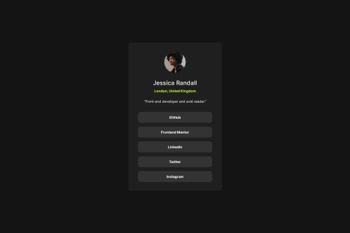
almost pixel perfect social links profile using SCSS CSS on steroids'

@AReactDeveloper

Desktop design screenshot for the Social links profile coding challenge

This is a solution for...

  • HTML
  • CSS
1newbie
View challenge

Design comparison


SolutionDesign

Solution retrospective


What are you most proud of, and what would you do differently next time?

Hello again dear community in this project i used scss preprocessing i didn't wanna use just vanilla like previous one i wanted to learn something new every challenge from this website i tried to get this as pixel perfect as possible though sometimes that gave me a headache considering its very hard to calibrate between margin and padding i know basic box model stuff but I've always struggled with that if you have any tips please leave them down below ill make sure to mark your comment as helpful comment if you care to spare time to review my code help me out with my mistakes and stuff i appreciate that a lot also thank you much for passing by

What challenges did you encounter, and how did you overcome them?

trying to get pixel perfect design while calibrating width and height with margin and padding I don't think I overcame that

Community feedback

@MadArtistPhoto

Posted

I too struggle with 'pixel perfect or close enough' . What makes it more challenging is in the free versions the font size and colors in the style.md file and on the design images occasionally don't quite match. I'm working on my seventh challenge and I find myself leaning more and more towards the 'close enough' end of the scale.

The one thing many people seem to miss in this challenge is when in the 'active state' the pointer turns to a black hand.

Marked as helpful

1

@AReactDeveloper

Posted

@MadArtistPhoto trust me although it looks good in the review mine was close enough as well its a great thing to chase that perfection but you don't wanna run into burnout I'm working all my challenges in the pixel perfect approach its gonna be more challenging once the projects get bigger thank you for you comment

0
geomydas 1,060

@geomydas

Posted

No need to make them pixel perfect, as long as it looks like the design. You might be slowed down by a lot if you try to make them pixel perfect without a figma file

Marked as helpful

1

@AReactDeveloper

Posted

@geomydas i totally agree however it is a good practice to satisfy your designer colleagues vision in case you are working in a team environment and clients and employers specially non technical ones (hr / owners / share holders ) tent to judge your work on how close it is to the design or sketch or UI design provided by the designer for a beginner level yes

0
geomydas 1,060

@geomydas

Posted

@AReactDeveloper it is indeed a good practice but realistically there would not be sufficient time due to deadlines, etc.

Marked as helpful

1

@AReactDeveloper

Posted

@geomydas true it takes a lot of time just to calibrate things but as for learning i learn a lot chasing that perfection but perfectionism is costing for development so i agree

0
Darkstar 1,000

@DarkstarXDD

Posted

As someone has already mentioned it here, I too would suggest you to stop focusing on "pixel perfect". Often, you can only achieve it for very specific screen sizes using bad CSS techniques. Instead what you should focus is developing a website that is accessible and looks good on all screen sizes.

There is a small improvement you can do in your code. You are using min-width for the .profile container, causing it to overflow on screens that are below 370px in width. You can see this if you resize your screen in the browser dev tools. You should develop a solution that looks good on screen sizes down to 320px. min-width is not needed for a container. What you need is a max-width so that the container won't keep expanding forever as the screen size increases.

0

@AReactDeveloper

Posted

@DarkstarXDD its very true it looks pretty bad on mobile devices which something I've got to find a solution for my focus was on generating a pixel perfect version of the design and that cost the design heavily I like the point you made and its very valid ill work on it thank you so much

0

@AReactDeveloper

Posted

@DarkstarXDD I fixed finally thanks to you I noticed fun fact I actually wrote the media query for it but I was in a rush to post it here I also fixed the min-width issues I just wanna thank you for taking the time suggesting these changes I appreciate it

0

@AReactDeveloper

Posted

@DarkstarXDD now it looks good on all devices down to 320px

0
Darkstar 1,000

@DarkstarXDD

Posted

@AReactDeveloper Nice looks good. But you don't need the media query. As soon as you remove the min-width it will be responsive.

1

@AReactDeveloper

Posted

@DarkstarXDD yes it did right away which i thank you for , however i wanted to match the mobile design provided in the challenge so i used media query just couple lines of code looks good

1

Please log in to post a comment

Log in with GitHub
Discord logo

Join our Discord community

Join thousands of Frontend Mentor community members taking the challenges, sharing resources, helping each other, and chatting about all things front-end!

Join our Discord