Not Found
Not Found
Not Found
Not Found
Not Found
Not Found
Not Found
Not Found
Not Found
Not Found
Not Found
Not Found
Not Found
Not Found
Not Found
Not Found
Not Found
Not Found
Not Found
Not Found

Submitted

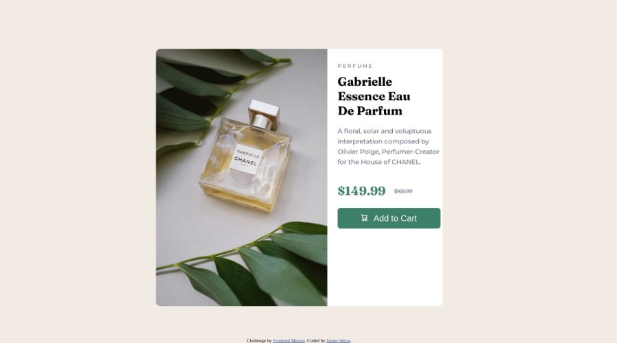
Almost correctly responsive perfume product preview card

@jamesweiss213

Desktop design screenshot for the Product preview card component coding challenge

This is a solution for...

  • HTML
  • CSS
1newbie
View challenge

Design comparison


SolutionDesign

Solution retrospective


It looks almost perfect, but I have a problem when it's going from a laptop screen to phone. It looks fine as soon as it goes to phone pixel amount, but in between, the "add to cart" button is not aligned perfectly so it looks off. Wasn't sure how to fix that at this point. I made it better than it was by adding a div called "button container" and made it hold the div in place, but it wasn't as successful as I would've liked. If you can come up with solutions for that, that would be amazing, and I'll try to maybe repost and fix it. Also, I don't know how it looks on a bigger screen than a 14in laptop, so for all I know, it looks super wonky on a big screen. Sorry :(

Community feedback

hitmorecode 6,230

@hitmorecode

Posted

I just opened your page and the left and right side are disconnected, there is a gap between. This is caused by;

/* this is what it's creating that gap */
.left-container{
display:flex;
flex:1;
}
``

Also the card is too high there is a lot of empty space at the bottom. The right side is OK, but you can make some adjustments.

- Remove `margin-top` on the word perfume and `margin-bottom` on the button.
- Add `padding` all around the right side

On small screen you just have to fix the height, because there is too much empty space at the bottom. Other than that it looks good.

One more thing, you don't need to use two media queries, one should be enough.
1

@jamesweiss213

Posted

@hitmorecode Thank you for checking out my code! I will open back the code and try again come Monday since today is a storyboarding day instead of a coding one, and this weekend I will be on a hiking trip! :D

Unfortunately, I don't have a larger screen than this laptop as I'm working now outside of the country I usually live in. I will give this a try, but I don't know how to fix the "bigger screen" issue since I'll be essentially modulating things completely blind on my end.

I will keep that media query tip in mind in the future! What you said makes sense! It does also help a newbie like me compartmentalize in my mind what each screen, individually, needs so it helps a newbie like me learn "what do I need in general and what do I need that's specified for this sized screen." Like giving certain elements and classes specific attributes in general and maybe changing that with the screen size helps my newbie brain understand what I'm doing a little more cleanly. But going forward, I will think to switch over to using only one query for any ADDITIONAL screen sizes and just have 1 main screen (probably laptop screen as of now).

Thank you for your feedback! It's much appreciated. I remember that there was a website where you can preview stuff in different screen sizes, even larger ones, but I'm not sure if I remember it. If you know what I'm talking about or how to figure that out, that might help me look at what I'm doing for a bigger screen.

Best,

James

0
hitmorecode 6,230

@hitmorecode

Posted

@jamesweiss213 sometimes you need to get away from coding 😁 to reset your brain, otherwise you might hit a wall and get stuck. For these beginners challenges you only need two media queries, because now we are only working with cards. Later once you get to junior challenges, you'll need two media queries, one for tablet and one for desktop. Just keep in mind that tablets can be used in portrait or landscape mode.

You can use these two sites to check the responsiveness of your page.

Responsive design checker

Screenfly

I only use firefox, but on every browser dev tool you can adjust for each screen size.

1

@jamesweiss213

Posted

@hitmorecode I tried it again, so I got rid of the spacing in between the image and the right side, but now I still can't get the text to adapt to larger screens on the right side container. Maybe I gotta lock the height for the box containing the content, in general. Not sure.

0
hitmorecode 6,230

@hitmorecode

Posted

@jamesweiss213 I will see how I can fork your repository make some changes and send it back to you.

I've created a fork form your repository. I cleaned up your hmtl and created a basic CSS, see if you can take it from here. If you get stuck, let me know.

I've sent you an invite to joy the forked repository.

0

Please log in to post a comment

Log in with GitHub
Discord logo

Join our Discord community

Join thousands of Frontend Mentor community members taking the challenges, sharing resources, helping each other, and chatting about all things front-end!

Join our Discord