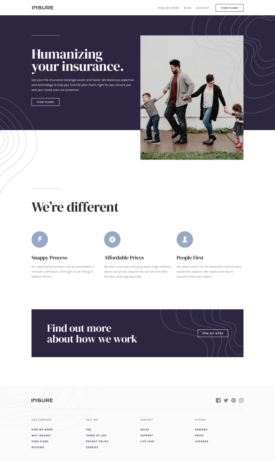
Design comparison
SolutionDesign
Solution retrospective
I did not know how to make hamburger menu like in original example so i uses google icon ones.
I think css became a huge mess, need better way to keep it more organized.
Community feedback
Please log in to post a comment
Log in with GitHubJoin our Discord community
Join thousands of Frontend Mentor community members taking the challenges, sharing resources, helping each other, and chatting about all things front-end!
Join our Discord
