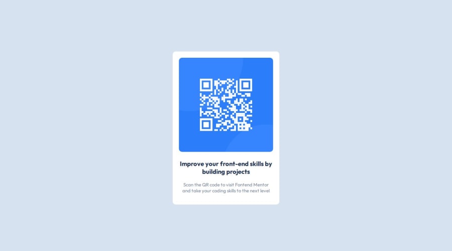
Design comparison
Solution retrospective
Honestly, I am proud of making a duplicate of something simple! Even though this was marked as beginner easy, it was not easy for me. I had to jump over a large hurdle to learn but eventually I got it! What I would do differently is to prepare myself. I cannot simply throw myself into code!
What challenges did you encounter, and how did you overcome them?A big challenge I encountered is generally CSS. My weak spot right now is general styling and CSS. Particularly I want to improve on layouts, aesthetics, and positioning so I can make awesome websites and programs! I overcome them by literally coding more simpler. Whereas before, I had longer lines of code on HTML (which was unnecessary and the final lines of code on HTML is much shorter) and very little lines of code on CSS because I had no idea what I was doing. However, by watching some youtube videos and completing some curriculum classes on freeCodeCamp, I was able to make the final product! It was actually really easy to do.
What specific areas of your project would you like help with?As mentioned, I am having a tough time with general styling and aesthetics. I need to work on layouts, positioning, and aesthetics.
Community feedback
Please log in to post a comment
Log in with GitHubJoin our Discord community
Join thousands of Frontend Mentor community members taking the challenges, sharing resources, helping each other, and chatting about all things front-end!
Join our Discord
