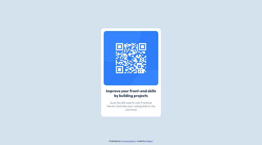
Design comparison
Solution retrospective
I was unsure what the width of the component should be. I set the size based on the design example in mobile version.
I don't think I needed the flex-container and a component div inside it. It was a remnant from when I was playing around with where I should place the attributions. I don't know where attributions generally go so I decided to place in the bottom.
Community feedback
- @visualdennissPosted over 1 year ago
Hey there,
your solution looks great overall!
My suggestion would be to use em or rems for font-sizes and other elements (expect for icons, they can be in fixed sizes). Here is a great resource about that https://www.youtube.com/watch?v=dHbYcAncAgQ
Also you seem to be using: display: grid; grid-template-columns: 1fr min-content 1fr; grid-template-rows: 1fr min-content 1fr; height: 100vh;
to center the item. Which seems to be working perfectly. However there is a simpler way of centering as well:
display: grid; place-items: center; will do and save you some lines of code :)
Hope you find this feedback helpful!
Marked as helpful1@madosyPosted over 1 year ago@visualdenniss honestly, I totally forgot about "place-" property! Thanks for the reminder and the other suggestions.
0 - @HassiaiPosted over 1 year ago
Replace<div class="container">with the main tag, <h2> 2ith <h1> and <div class="attribution"> with the footer tag to fix the accessibility issues. click here for more on web-accessibility and semantic html
Every html must have <h1> to make it accessible. Always begin the heading of the html with <h1> tag wrap the sub-heading of <h1> in <h2> tag, wrap the sub-heading of <h2> in <h3> this continues until <h6>, never skip a level of a heading.
Give h1 and p the same font-size of 15px which is 0.9375rem, text-align: center,the same margin-left, margin-right and margin-top values. Give p a margin bottom value.
Use relative units like rem or em as unit for the padding, margin, width values and preferably rem for the font-size values, instead of using px which is an absolute unit. For more on CSS units Click here
Hope am helpful.
Well done for completing this challenge. HAPPY CODING
Marked as helpful1@madosyPosted over 1 year ago@Hassiai Appreciate your feedback! Web accessibility is something that I reviewed awhile back in my learning journey and need another review for sure. I am not used to relative units but will include in my practices more.
0 - @cuonglyyPosted over 1 year ago
Hello Madosy,
Great job on finishing this challenge! Here are some suggestions that I recommend:
-
Instead of wrapping your main content with
<div>
, you can use a semantic HTML element<main>
as it provides accessibility and defines the main content of your document! Thus, I would change<div class="content">
to<main class="content">
, and<div class="attribution">
to<footer class="attribution">
-
To center the QR code component, you can use
display: flex
instead ofdisplay: grid
. Here's an example:
body { display: flex; justify-content: center; align-items:center; }
- Each webpage should have a
<h1>
element as it describes the main context of your document. In this case, I would simply replace<h2>
with<h1>
Hope this helps! Happy coding (-:
Marked as helpful1@madosyPosted over 1 year ago@cuonglyy Thanks for the feedback! Semantic HTML element is a great point and something I definitely need to include in my practice. Appreciate the other points as well.
0 -
Please log in to post a comment
Log in with GitHubJoin our Discord community
Join thousands of Frontend Mentor community members taking the challenges, sharing resources, helping each other, and chatting about all things front-end!
Join our Discord