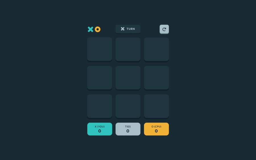
Design comparison
Solution retrospective
I think the most difficult thing was integrating how I coded with an existing algorithm for minimax, it took quite some time. As for the areas I'm unsure of, well... I did not bother to implement any media queries since the website looked fine at all screen sizes. Maybe I was just being lazy but it did not really seem necessary. Additionally, I think my style of coding JS could use some work, in the end, the JS file was over 600 lines, which might be frowned upon by some individuals. How can I improve upon this?
With regards to how I did the HTML/CSS/JS, is there anything else I could improve upon? Thanks
Community feedback
- @Developer-AshutoshPosted about 1 year ago
hey bro can you provide me the figma file please
0
Please log in to post a comment
Log in with GitHubJoin our Discord community
Join thousands of Frontend Mentor community members taking the challenges, sharing resources, helping each other, and chatting about all things front-end!
Join our Discord
