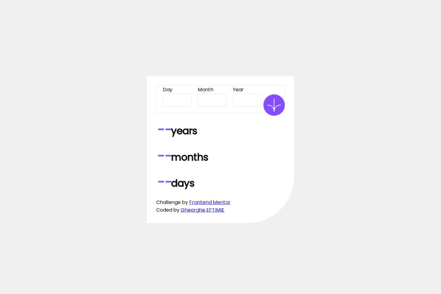
Design comparison
SolutionDesign
Solution retrospective
Feedback for improvements of the Js Result calculator part is absolutely welcome!
Community feedback
- @GioKhabuPosted 9 months ago
Hello Eftimie,
Nice work, functionality works perfectly. I would just suggest few points:
- First of all for inputs you can add placeholders like it is in the initial design DD, MM, YYYY.
- You also can wrap all inputs with the "form" element so on submit when user clicks enter on the keyboard it will calculate results not only on the click handler.
- For class='input-flex' you can just have border-bottom property so it will have just border on the bottom.
- To align the button properly you can add position: absolute and to its parent on class='input-flex' position relative. With that you can place the button anywhere you would like with the properties: top, left, right, bottom.
- Semantically it is recomended to have only one h1 element on page and others you can make as h2s.
- Finally, you can have more margin with results and labels and also make text more bold.
Wish you success with other projects.
Marked as helpful0@bigghitza96Posted 9 months ago@GioKhabu Thank you very much for your feedback, I will apply what you said on next projects I will take. Wish you success to.
1
Please log in to post a comment
Log in with GitHubJoin our Discord community
Join thousands of Frontend Mentor community members taking the challenges, sharing resources, helping each other, and chatting about all things front-end!
Join our Discord
