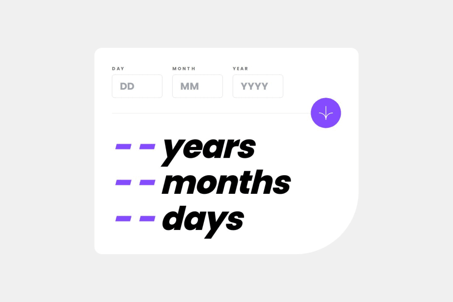
Age Calculator with Responsive Design and Validation
Design comparison
Solution retrospective
I'm proud of replicating the challenge design accurately while having fun with the development process. Next time, I'd like to explore implementing a dark/light mode theme to enhance user experience.
What challenges did you encounter, and how did you overcome them?I encountered a few hurdles during development, including resolving a 404 error. Learning Tailwind CSS for the first time presented a challenge, and I also needed to familiarize myself with React Spring. Centering components and aligning elements according to the challenge image required some careful adjustments.
What specific areas of your project would you like help with?Since I'm confident with the current functionality, I'm not seeking specific help at this time.
Community feedback
- @R3ygoskiPosted 6 months ago
Hello Rohan, your project looks great and extremely similar to the proposed design, congratulations.
I would like to point out that there seems to be an issue with the logic of your project, as when I entered the date "14/07/2001", it worked perfectly, but when I changed the "07" to "04", it caused the month to stop appearing. And this also happened when I changed the day to "30".
I haven't looked at the code yet, but it seems like this is a conditional error, where values similar to the current date are not being applied.
Edit: I also noticed that in your
AgeForm
component, you are passing some props with repeated names to the inputs. A suggestion would be to pass only thename="year"
, for example, instead of alsoid
andlabel
, as they are the same. Then in the Input component, you would use only thename
for those parts that are usingid
andlabel
.Edit2: I also noticed that you are using a RegExp that enforces the year to always have 4 digits, but this wasn't necessary. For example, if I enter "0900", it will still work. Perhaps it would be more interesting to remove this requirement from the RegExp. Additionally, if someone wants to calculate the age of a historical figure in the present day, this limitation would be quite restrictive. But it's just a suggestion.
Apart from that, everything seems to be working very well. My sincere congratulations, your project looks great.
Marked as helpful1@rohanvronPosted 6 months ago@R3ygoski
Hi Bernardo,
Thank you so much for the detailed feedback on my age calculator project! I'm thrilled to hear that it looks great and closely resembles the design.
You're absolutely right about the issue with changing the month causing some issues. I'll definitely investigate and fix the logic behind that.
I appreciate the suggestion about simplifying the input props in the AgeForm component. That will definitely improve readability.
Regarding the year validation, removing the 4-digit requirement is a great point. It would allow for more flexibility in calculating historical figures' ages. I'll adjust the regular expression accordingly.
I'm still new to coding, so your insights are incredibly valuable. Thanks again for taking the time to test my project and provide such constructive feedback. I'll work on these issues.
Edit: I implemented all your suggestions: logic fix, simplified props, and flexible year validation. Thanks again!
1 - @0xabdulkhaliqPosted 6 months ago
Hello there π. Congratulations on successfully completing the challenge! π
- I have a suggestion regarding your code that I believe will be of great interest to you.
MAKING ACCESSIBLE BUTTON :
- Your solution's
button
markup is not accessible for the following reasons:
- Lack of accessible name: The
<button>
element does not have any text content or anaria-label
attribute that describes its purpose or function. Thealt
attribute on the<img>
element inside the button is not an adequate replacement for an accessible name.
- Incorrect use of
<img>
inside<button>
: While it is possible to have an<img>
element inside a<button>
, the<button>
should also have a text label or anaria-label
attribute to provide an accessible name for the button.
- To make the button accessible, you should either add a text label between the opening and closing
<button>
tags or add anaria-label
attribute to the<button>
element that describes its purpose or function.
- Here's an example:
<button aria-label="Click to calculate your age" type="submit" class="btn"> <img alt="" class="h-6 lg:h-11" src="..."> </button>
.
I hope you find this helpful π Above all, the solution you submitted is great !
Happy coding!
0@rohanvronPosted 6 months ago@0xabdulkhalid
Hi Abdul,
Thanks so much for pointing out the accessibility issue with the button! I'll definitely add an aria-label to improve usability for everyone.
Edit: Added aria-label to button for improved accessibility.
0@0xabdulkhaliqPosted 6 months ago@rohanvron Glad you found it helpful ! π€
0
Please log in to post a comment
Log in with GitHubJoin our Discord community
Join thousands of Frontend Mentor community members taking the challenges, sharing resources, helping each other, and chatting about all things front-end!
Join our Discord