Design comparison
Solution retrospective
Hi fm community,
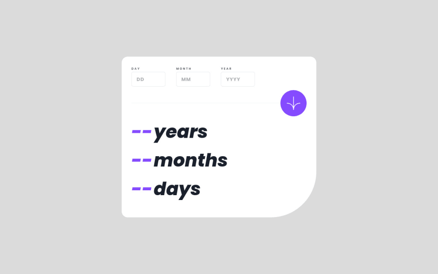
Here is my solution for this challenge.This was a really fun challenge to work with and if you have any suggestions or feedback, i'd really appreciate that.
Thank you ✌
Community feedback
- @Esesosa-maxPosted over 1 year ago
it is more accurate than the design
1 - @SinkycodePosted over 1 year ago
Smiles 😁
- If I'm to say, I would give you a 💯 for the UI but for the functionality I observed you were pretty smart 🤓 there. Instead of running the validation when the form values are submitted, you ran it when it's click 😁. That's a hack 😂. Had it been I remembered I could do what you did, I would've done it because it was a pain in the ass to run all calculation and all validation with one button 🔘.
1@KruzadeR-VictoRPosted over 1 year ago@mosfresh yeah i thought of doing the same initially,but it'd be a bit lengthy with all the calculation and validations as you said, so i went with the Formik and yup validation.And it actually validating when you're typing values as well as at the time of submission, which is a pure advantage .
Thanks for your feedback ✌
1@SinkycodePosted over 1 year ago@KruzadeR-VictoR Wow 😮 Formik and yup? I guess I may test them out one day
1
Please log in to post a comment
Log in with GitHubJoin our Discord community
Join thousands of Frontend Mentor community members taking the challenges, sharing resources, helping each other, and chatting about all things front-end!
Join our Discord
