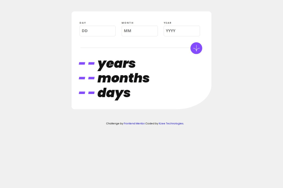
Design comparison
Solution retrospective
I am most proud of my research skills, as it has really improved, also I am proud of how I implemented the results of my research on this project, how I used the JS statements and functions, conditionals as well. I would surely try to use the best practice next time and work on my html tags too as well as CSS properties.
What challenges did you encounter, and how did you overcome them?Validation challenges, I had some issues with all the exact validations and how to implement the error messages, also with month and day logic as well, the year difference logic was quite simple. I overcame through intense research and implementation of the results gotten from my research.
What specific areas of your project would you like help with?Is there a way I can make the submit event function shorter?
Community feedback
- @AdrianoEscarabotePosted 28 days ago
Hi Prince95-cmd, hope you're doing well! I loved how your project turned out, but I’ve got a few suggestions that could be useful:
Using Flexbox or Grid on the
bodyto center elements ensures a more responsive and adaptive layout, fitting different screen sizes seamlessly. It avoids manual calculations and constant adjustments needed withmargin,padding, or absolute positioning. These techniques provide more consistent alignment and simplify the code.flexbox:
body {
    display: flex;
    justify-content: center;
    align-items:  center;
    min-height: 100vh;
}
grid:
body {
    display: grid;
    place-content: center;
    min-height: 100vh;
}
The rest is fantastic.
Hopefully, you'll find it helpful. 👍
0@Prince95-cmdPosted 27 days ago@AdrianoEscarabote I really appreciate your review, and thanks for this helpful suggestion as well, I will make sure to put it into practice, thank very much.
1
Please log in to post a comment
Log in with GitHubJoin our Discord community
Join thousands of Frontend Mentor community members taking the challenges, sharing resources, helping each other, and chatting about all things front-end!
Join our Discord
