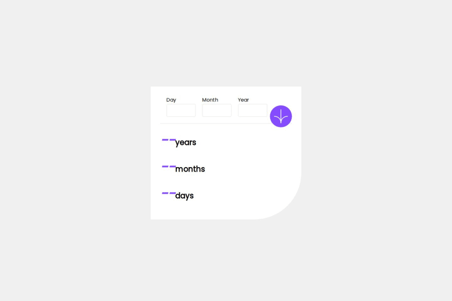
Design comparison
Solution retrospective
I did this challenge when I had no idea what a frontend mentor was, a friend sent it to him to do it and that's how it all started, it is possible that it is full of bad practices and others, I tried to fix the semantic part but I know it can be polished more.
Community feedback
- @grace-snowPosted 6 months ago
I'm afraid you need to rewrite the html in this
- it must use a form with a submit button
- the date inputs must be wrapped in a fieldset with a legend (this can be sr-only if needed).
- each input must have a label.
- each input must have an appropriate autocomplete attribute.
- each input should have a programmatically linked error. container. You do that with a unique ID on each error element and aria-desciribedby on each input pointing to its error id.
- the errors should have aria-live attributes.
- the submit button must have an accessible name. You can do that with img alt, sr-only text inside the button, or aria-label on the button.
- the results content should be wrapped in an element that has an aria-live attribute.
- the results content should ideally have a visually-hidden (sr-only) heading.
- the results content is definitely not appropriate for heading content. At best it is a paragraph, or can be 3 paragraphs if you really want.
- all of this should be inside a
mainlandmark.
I recommend you trigger errors on blur not on input. It's a horrible user experience for errors to pop up constantly.
0
Please log in to post a comment
Log in with GitHubJoin our Discord community
Join thousands of Frontend Mentor community members taking the challenges, sharing resources, helping each other, and chatting about all things front-end!
Join our Discord
