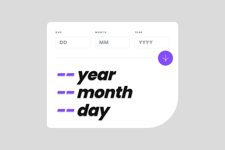
Design comparison
SolutionDesign
Solution retrospective
Hi everyone, this is my solution to Age Calculator App challenge.
Feel free to add feedback on the comments. 👋
Community feedback
- @HeyChobePosted 10 months ago
Nice bro! I recommend you a few things:
- Try to change the background color correctly (use this -> #F0F0F0).
- Try to adjust the height of fonts and paddings.
- Adjust correctly the input widths.
After all, all works fine!!! Congrats! 👌👌👌👌
Marked as helpful1
Please log in to post a comment
Log in with GitHubJoin our Discord community
Join thousands of Frontend Mentor community members taking the challenges, sharing resources, helping each other, and chatting about all things front-end!
Join our Discord
